

Use one north-star metric, three to five input metrics, and a health panel covering cash, burn, and runway as your weekly startup KPI dashboard. This structure is what Waveup recommends as a hierarchy founders can act on instead of drowning in charts. Tools like Vetros can help build and maintain automated startup KPI dashboards, simplifying setup without requiring a dedicated data engineer.
TL;DR:
- A startup KPI dashboard should focus on one north-star metric that reflects customer value and drives revenue or retention over time.
- It must include three to five input metrics, such as activation rate or CAC, and separate health metrics like cash, burn, and runway for assessing financial stability.
- Consistent definitions and fixed formulas across teams are crucial to ensure reliable trend analysis and effective decision-making.
- Building and maintaining a streamlined dashboard requires discipline and clear ownership, with automated tools like Vetros simplifying data connection and model updates.
- Limiting the dashboard to a few key metrics ensures weekly reviews are meaningful, actionable, and prevent analysis paralysis from excessive, unused data.
Table of Contents
- What is a startup KPI dashboard?
- Priority KPIs: your north star, inputs, and health metrics
- Dashboard examples founders can copy this week
- Which KPIs matter at each startup stage
- How to build your dashboard step by step
- Running the weekly metrics review
- Data quality and dashboard implementation choices
- How Vetros fits the build process
- Why fewer metrics beat more dashboards
- Get your dashboard running without hiring a data team
- Sources
- FAQ
What is a startup KPI dashboard?
A KPI dashboard is not a pile of charts. It is a small set of numbers that exists to drive one decision a week: keep going, change something, or stop.
A metric is a number. A KPI is a metric with three things attached: an owner, a target, and a trigger that says what happens when the number misses. Without those three, a dashboard is decoration.
The job of the dashboard is to make disagreements about direction shorter. When everyone on the team looks at the same number, defined the same way, arguments move from "what happened" to "what do we do about it." Carta makes this point directly: consistent definitions of recurring revenue, acquisition, churn, and engagement matter more than any visualization choice, because ambiguity in what a metric means is a bigger risk than a chart being ugly.
A good dashboard produces three outcomes:
- Faster decisions, because the number that matters is visible before the meeting starts.
- Alignment, because the whole team is arguing about the same figure instead of different spreadsheets.
- A single source of truth that replaces the "which version of this number is right" conversation entirely.
Priority KPIs: your north star, inputs, and health metrics
Pick a north star first. It should pass three tests: it reflects real customer value delivered (not vanity activity), your team can move it through its own actions, and it correlates with revenue or retention over time. Weekly active teams using a product, not signups, is usually the better choice. Signups without usage tell you nothing about whether anyone got value.
Input metrics are levers that feed the north star. Common choices include:
- Activation rate: the share of new users who complete a defined first-value action.
- Funnel conversion: the percentage moving from trial or signup to pay.
- Feature adoption: usage of the specific feature tied to retention.
- Referral or organic share: how much growth comes without paid spend.
Pick three to five. More than that and the weekly review turns into a status report nobody reads.
Health metrics sit apart from growth metrics because they answer a different question: how much time do you have left. Keep MRR or ARR, monthly burn, runway in months, and gross margin on every dashboard regardless of stage. Waveup notes that if input metrics move but the north star does not, that is a signal to revisit the causal model or the metric definition itself, not to add more charts.
A weekly, board-ready dashboard should stay small: one north star, a handful of inputs, and separated health metrics. The Startup Metrics Dashboard Template built for board decks and weekly reviews centers on exactly this kind of short list, including MRR/ARR, new revenue, expansion, churn, unit economics, and monthly burn.
Definitions have to stay fixed across time and across teams. If sales counts a "customer" differently than finance, every trend line built on top of that number is unreliable. Carta treats this as shared vocabulary work that has to happen before any dashboard gets built, and cohorting by signup date or plan type is what keeps comparisons honest as the business changes shape.
Dashboard examples founders can copy this week
Different roles need different views of the same underlying numbers. Building one dashboard per audience, rather than one giant dashboard for everyone, keeps each view usable.
- Executive view: north star with its trend line, the top three risks facing the business right now, and a cash snapshot showing current balance and runway.
- Growth view: full funnel from visit to paid customer, customer acquisition cost broken out by channel, and conversion rate at each funnel step.
- Finance view: burn rate, runway in months, burn multiple (net burn divided by net new revenue), and quick ratio.
- Product view: activation rate, weekly active users, adoption of the core feature, and cohort retention curves by signup month.
- Sales or SaaS view: MRR movement broken into new, expansion, and churned revenue, net revenue retention, logo churn, and average revenue per account.
Each tile should show three things at once: the current value, the trend direction, and a target or benchmark line. A number with no comparison point is close to meaningless.
For the finance view specifically, keep these tiles side by side:
- Burn rate: net cash spent per month.
- Runway: months of cash remaining at current burn.
- Burn multiple: net burn divided by net new annual recurring revenue, useful for judging capital efficiency.
- Quick ratio: growth revenue divided by lost revenue, a fast read on whether growth is outrunning churn.
SaaS efficiency metrics like these are most useful once your internal definitions are locked and tied consistently to cohort, stage, and date, according to Acuity. Chasing a fashionable formula without that consistency produces a number that looks precise and means nothing.
Which KPIs matter at each startup stage
The right dashboard changes as the company changes. A pre-seed team obsessing over burn multiple is wasting a metric it cannot yet act on; a Series A company still staring at raw signups is missing the numbers investors and its own board actually care about.
At pre-seed, focus on product usage and early retention. You are testing whether anyone gets value at all, so activation rate, week-one and week-four retention, and qualitative usage patterns matter more than revenue.

At seed, the focus shifts to repeatable acquisition and the first read on unit economics. CAC by channel, payback period, and early LTV:CAC estimates tell you whether the growth engine you are building can actually scale.
At Series A and beyond, the dashboard should center on revenue growth rate, net revenue retention, burn multiple, and sales efficiency measures like magic number or CAC payback in months. Waveup frames this as a deliberate progression: retention proves product-market fit, unit economics prove go-to-market fit, and revenue plus capital efficiency prove the business is ready to scale.
Move older metrics to a secondary view rather than deleting them. Retention still matters at Series A, it just is not the number driving this week's decision anymore.
- Pre-seed: activation, early retention, qualitative usage signals.
- Seed: CAC by channel, payback period, early LTV:CAC.
- Series A and scale: revenue growth, NRR, burn multiple, sales efficiency.
Pro Tip: When you promote a new north star, keep the old one visible in a secondary panel for a month so the team can confirm the new metric actually reflects reality before fully committing to it.
How to build your dashboard step by step
Building the dashboard is mechanical once the metrics are chosen. The hard part is discipline, not tooling.
- Write the equation connecting each input metric to the north star, and assign an owner to each input. 1752 argues this step is what makes an input testable rather than decorative: if you cannot write the formula, you probably picked the wrong input.
- Connect your data sources: billing system, product analytics, CRM, and any spreadsheets still holding manual data. Pull a sample from each and check it against numbers your team already trusts.
- Model the metric definitions in one place so "customer," "active user," and "churn" mean the same thing everywhere they appear.
- Build tiles that show current value, trend, and a target or benchmark line rather than a bare number.
- Set refresh cadence and alerts, then write down the measurement rules so a new hire can read the dashboard the same way the founder does.
Centralizing this in one connected system, rather than juggling exports, is what Salesforce points to when it recommends pairing CRM and BI tools: shared visibility plus automated alerts means the team acts on a number faster than if someone has to remember to check it.
- Billing and analytics tools need a validation pass before anyone trusts the first dashboard version.
- Every metric definition should live in a single document the whole team can reference.
- Alerts should fire on the health metrics first: cash problems move faster than growth problems.
Running the weekly metrics review
A dashboard nobody reviews is wasted work. Put a recurring 30-minute slot on the calendar and update the shared dashboard before the meeting starts, not during it.
- Review north star first. State the current number, the change from last week, and whether it is on track or off track against target.
- Move to inputs, in the same format: number, change, status.
- Close with health metrics, since cash problems override everything else on the dashboard.
- Assign one action per miss, with a named owner and a deadline before next week's review.
- Log the decision so the team can check progress against it next week instead of relitigating the same conversation.
A weekly review with this order and one action per miss is a high-leverage habit for small teams, according to the Startup Metrics Guide, and the decision log is what turns a dashboard from a status report into an operating tool.
Data quality and dashboard implementation choices
A handful of governance decisions determine whether the dashboard stays trustworthy six months in.
- Run simple validation checks on incoming data and sample a few rows manually before trusting a new source.
- Set refresh cadence per metric rather than defaulting everything to real time: cash needs daily updates, retention cohorts do not.
- Define permission levels so executives see the full picture while individual teams see only what is relevant to their view.
- Use color sparingly and consistently, mark a clear target line on every trend chart, and separate a point-in-time snapshot from a trend so readers do not confuse the two.
Real-time refresh sounds impressive but is rarely worth the engineering cost for metrics that only change weekly, like retention cohorts or NRR. Save the real-time budget for cash position and daily active usage, where a delay actually changes a decision.
Pro Tip: If a metric would not change what you do this week, it does not need to refresh faster than once a week.
How Vetros fits the build process
Most of the build checklist above assumes a team member who can connect sources, write metric definitions, and maintain the pipeline over time. Vetros is built for teams that do not have that person on staff.
Founders describe what they want to see in plain language, and Vetros connects to the underlying data sources, models the metrics, and builds and maintains the live dashboard automatically, according to its own product description at Vetros. That covers the source-connection and modeling steps from the build checklist without a manual pipeline.
- Faster source connection: no separate integration project before the first dashboard exists.
- Less manual modeling: metric definitions get set once and applied consistently across tiles.
- Full code visibility: users can read and modify the underlying logic directly rather than trusting a black box.
- Data stays private within the user's own cloud environment.
Why fewer metrics beat more dashboards
Most startup dashboards fail from excess, not scarcity. Founders add a tile every time a question comes up in a meeting, and within two quarters the dashboard has thirty metrics that nobody reviews in full.
The goal was never the dashboard. It was the decision it was supposed to trigger. A dashboard with one north star, four inputs, and three health metrics gets read every week. A dashboard with thirty metrics gets opened once and then ignored.
Pick fewer numbers, assign a real owner to each, and protect the weekly review time even when the week gets busy.
— Ąžuolas
Get your dashboard running without hiring a data team
Building the structure in this article by hand takes real time: connecting sources, writing metric definitions, and keeping pipelines alive as tools change.
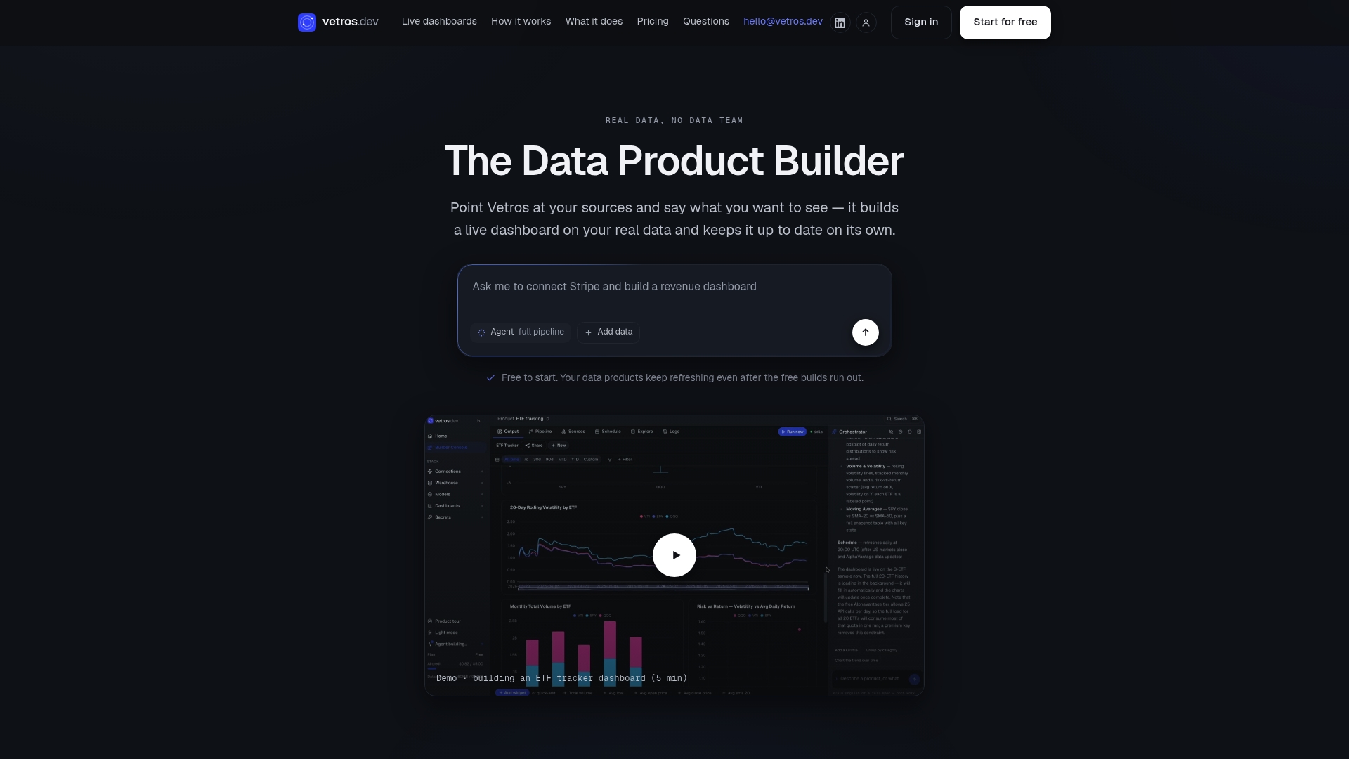
Some platforms handle that work automatically. By describing the north star, inputs, and health metrics you want tracked, these platforms connect your data sources, model the definitions, and keep the dashboard live without a dedicated data engineer. Start a free trial or check the Vetros plans to see which tier fits your team.
Sources
- Startup KPIs: What to track at each stage (with formulas & examples) | Waveup
- Startup Metrics Dashboard Template: KPI Tracking | The Startup Project
- Tracking key metrics (Acuity) — guidance on SaaS efficiency metrics
- Startup metrics & KPIs founders need to know | Carta
FAQ
What are some good dashboards for KPIs?
Strong KPI dashboards separate views by audience: an executive dashboard with the north star and cash snapshot, a growth dashboard with funnel and CAC data, and a finance dashboard with burn and runway. Tools like Power BI or an automated platform like Vetros can build these views once the metric definitions are set.
What are the 5 main KPIs?
There is no single universal list, since the right five depend on your stage and business model. A common starting set covers one north-star metric, an activation or conversion rate, customer acquisition cost, monthly recurring revenue or its growth rate, and runway.
Can ChatGPT create a dashboard?
ChatGPT can help you draft metric definitions, write the formulas linking inputs to a north star, or plan a dashboard layout, but it cannot connect live to your data sources or maintain a running dashboard on its own. Platforms built specifically for this, including Vetros, handle the live connection, modeling, and maintenance instead.
How do I create a KPI dashboard?
Pick a north star metric, add three to five input metrics your team can influence, and add health metrics for cash, burn, and runway. Then connect your data sources, define each metric consistently, build tiles showing current value plus trend plus target, and set a weekly review cadence.