

Nine metrics separate dashboards that drive decisions from ones people ignore: quota attainment, pipeline coverage ratio, win rate, average deal size, sales cycle length, and three activity signals like meetings booked and connect rate. They belong together because each one either predicts next quarter's number or explains why a rep is missing it. Everything else, including the formulas, role-based views, and benchmarks, builds on that core six to nine.
TL;DR:
- Focus on a core set of 6 to 9 metrics that directly predict or explain performance, avoiding excessive tiles that cause clutter.
- Refresh outcome metrics weekly or monthly depending on their volatility, while activity signals should refresh daily for early warning signs.
- Pair lagging metrics like quota attainment with two or three leading indicators, such as meetings booked or pipeline coverage, for faster, behavior-driven insights.
- Tailor dashboards for specific roles with customized views: reps need deal-level details, managers focus on team patterns, and executives require forecast trends.
- Use automated, live dashboards connected to your CRM to ensure real-time updates and accurate formulas, reducing reliance on manual spreadsheet maintenance.
Table of Contents
- What a Sales Dashboard Is (and Why It's Not Just a Report)
- Core Sales Metrics and KPIs: Formulas and Refresh Cadence
- Leading vs. Lagging Metrics: How to Pair Them Correctly
- Role-Specific Dashboard Views: Rep, Manager, and Executive
- Visualization, Layout, and Refresh Cadence That Drive Action
- Benchmarks and Red Flags Worth Watching
- Common Pitfalls: Vanity Metrics, Averages, and Stale Data
- Why Live, Automated Dashboards Beat Static Spreadsheets
- Practical Priorities When You Build Your Own Dashboard
- Get a Live Sales Dashboard Without Building a Data Team
- Where These Benchmarks and Formulas Come From
- Sources
What a Sales Dashboard Is (and Why It's Not Just a Report)
A sales dashboard is a live, curated view of the key performance indicators a specific role needs to act on, pulled directly from your CRM and other source systems and refreshed on a schedule that matches how fast the underlying number changes. That's different from a report, which is a static snapshot built for a moment in time, usually to explain what already happened rather than to trigger what happens next.
The decision-rule for what belongs on a dashboard is simple: include a metric only if seeing it move would change what someone does that day. If a number sits there looking impressive but nobody adjusts a call list, a coaching session, or a forecast because of it, it doesn't belong on the dashboard. Put it in a report instead.
This distinction matters because most teams build dashboards the way they build reports, by piling on every metric someone once asked about. That's how you end up with 40 tiles and a sales team that stops looking at any of them.
A quick test for any metric you're considering:
- Does it change within days or weeks, not just at quarter-end?
- Would a rep or manager take a different action if it moved 10%?
- Is there a clear owner who's accountable for improving it?
If a metric fails all three, cut it.
Core Sales Metrics and KPIs: Formulas and Refresh Cadence
Every metric on a dashboard needs a formula precise enough that two people calculate the same number, a stated purpose, and a refresh cadence matched to how often the underlying activity actually changes. Vague definitions are why sales and finance argue about "the real pipeline number" every quarter.
Quota attainment measures actual revenue closed against the assigned target: (closed revenue ÷ quota) × 100. It's a lagging metric, but it's the one number every rep and manager checks first, so refresh it weekly, not monthly. A rep sitting at 40% attainment with three weeks left in the quarter needs that visible now, not on the first of next month.
Pipeline coverage ratio divides total open pipeline value by the remaining quota target. A ratio of 3x to 4x is the commonly cited target range for most B2B sales cycles, meaning you want three to four dollars of open pipeline for every dollar of quota still owed. Below that, you're likely to miss the number regardless of how well reps execute. This ratio is worth checking weekly since pipeline value shifts constantly as deals get created, pushed, or lost, with a commonly cited target range around three to four times the remaining quota.
Win rate is closed-won deals divided by total closed deals (won plus lost), expressed as a percentage. It's a lagging metric best reviewed monthly at the team level and by individual rep, since a dropping win rate often signals a qualification problem upstream rather than a closing problem.
Average deal size is total revenue divided by number of deals closed. Track it alongside win rate. A team that's winning more deals but at a shrinking average size might be discounting too aggressively or moving downmarket without meaning to.
Sales cycle length measures average days from opportunity creation to closed-won. Longer cycles tie up pipeline coverage and distort forecasts, so this is a monthly metric for most teams, weekly for high-velocity transactional sales.
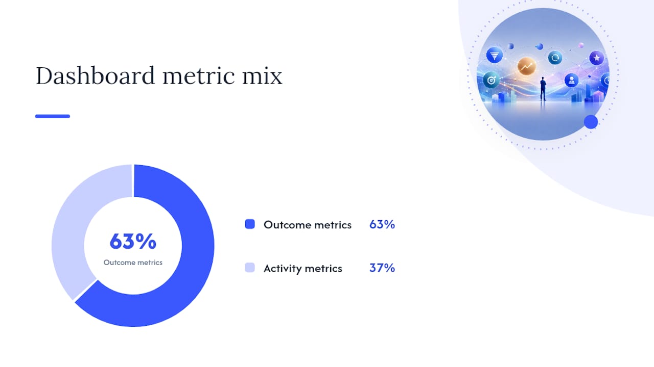
Sales teams that limit dashboards to a curated set of 6 to 9 metrics report clearer read on performance than teams tracking everything their CRM can export. More tiles rarely means more clarity.
Pair those five outcome metrics with activity signals that predict them before the quarter closes:
- Meetings booked per rep per week
- Calls or emails sent, tracked against a baseline, not in isolation
- Connect rate (conversations divided by dial attempts)
Activity metrics refresh daily. They're the earliest warning system you have, and by the time quota attainment tells you something's wrong, it's often too late to fix it that quarter.
Leading vs. Lagging Metrics: How to Pair Them Correctly
Lagging metrics tell you what already happened, like closed revenue or win rate. Leading metrics predict what's about to happen, like meetings booked or pipeline created. Diagnostic metrics sit between the two, ratios that explain why a lagging number is moving, like conversion rate between pipeline stages or average pipeline velocity.
The pairing rule that works: for every lagging metric on a dashboard, show two or three leading indicators directly above or beside it. That spatial connection is what turns a dashboard from a scoreboard into a tool people actually use to change behavior, since effective dashboards map metrics to decisions by keeping cause and effect visible in the same glance.
Here's how the pairing typically works in practice:
- Above closed-won revenue, show pipeline coverage ratio and meetings booked this week.
- Above win rate, show connect rate and average number of touches per opportunity.
- Above quota attainment, show stage-to-stage conversion rates for the current pipeline.
Diagnostic ratios matter more than raw totals because totals hide the actual problem. A rep with 50 open deals and a low win rate could be failing at qualification, at discovery, or at negotiation, and a raw pipeline count won't tell you which. Stage conversion percentages will.
Pro Tip: If a lagging metric drops and none of its paired leading indicators moved first, that's usually a data problem, not a performance problem. Check whether deals are getting logged and staged consistently before you assume the rep is underperforming.
Role-Specific Dashboard Views: Rep, Manager, and Executive
A single dashboard trying to serve a rep, a manager, and a VP at once satisfies nobody, because each role needs different signals to act on: reps need deal-level detail, managers need coaching signals, and executives need forecast trends.
Rep view should stay narrow and personal:
- Quota progress this month/quarter (gauge chart)
- Top 3 to 5 open deals by value, with next-step deadline flagged
- Activity metrics: calls, meetings booked, follow-ups due today
- Personal win rate trend over the last four quarters
Manager view shifts from individual deals to patterns across the team:
- Quota attainment distribution across the team, not just the average, since averages routinely hide who's actually struggling
- Stalled deals flagged by days-in-stage beyond a set threshold
- Coaching queue: reps below 70% attainment with fewer than 20 days left in the period
- Pipeline by stage, viewed as a funnel
Executive or RevOps view zooms out to company-level predictability:
- Forecast accuracy: forecasted vs. actual close, tracked quarter over quarter
- Pipeline coverage ratio at the company and segment level
- Revenue growth rate and net retention for existing accounts
- Rep ramp time to full productivity, if hiring velocity matters to the business
The mistake most teams make is copying the executive dashboard down to the rep level, just with smaller numbers. A rep doesn't need company-wide net retention. They need to know which of their five deals is at risk this week.
Visualization, Layout, and Refresh Cadence That Drive Action
Chart choice should match what the metric is doing, not what looks impressive. A gauge or bullet chart works for quota attainment because it shows progress against a fixed target at a glance. A funnel chart fits pipeline by stage since it visualizes drop-off. A line chart is right for trends like win rate or average deal size over time, where the direction matters more than the single current value.
Layout discipline matters as much as chart choice. Cap visible metrics at 6 to 9 per dashboard and group them into quadrants: primary outcome metrics, leading indicators, diagnostic ratios, and alerts. That structure keeps the eye moving in a logical order instead of hunting across two dozen tiles.
Refresh cadence should match how fast each metric class actually changes:
| Metric class | Refresh cadence | Owner |
|---|---|---|
| Activity metrics (calls, meetings booked) | Real time or daily | Rep |
| Pipeline coverage, stage conversion | Daily | Manager |
| Win rate, average deal size | Weekly | Manager |
| Quota attainment | Weekly | Manager/rep |
| Forecast accuracy, revenue growth | Monthly | Executive/RevOps |
Alerts belong on the fastest-moving metrics, not the slowest. A deal that's gone silent for 14 days is worth a flag today. Quarterly revenue growth doesn't need one at all, since by the time it's alarming, the quarter is already over.
Benchmarks and Red Flags Worth Watching
Benchmarks vary by business model, so use ranges rather than single numbers, and calibrate them to your own sales cycle and deal size rather than importing a competitor's target wholesale.
Below 2x is a consistent red flag: it usually means a missed quarter is already baked in, regardless of how hard the team closes. Win rates vary widely by model, transactional deals often run higher, enterprise consultative sales lower, so compare a rep against their own team's historical average rather than an industry-wide figure.
Fragmented tool stacks that don't sync cleanly with a CRM are linked to forecast accuracy dropping by 20% to 30% compared to teams running integrated, automated data capture. That gap alone justifies fixing your data pipeline before worrying about which chart type to use.
Connect rate benchmarks depend heavily on channel and list quality, so track your own trend rather than chasing a published average. Ramp time to full quota productivity should be benchmarked against your own best historical cohort, not a generic "90 days" rule that ignores deal complexity.
To calibrate targets properly, segment by deal size, industry vertical, and rep tenure. A benchmark that blends a six-month enterprise sale with a same-day transactional close will mislead everyone it's applied to.
Common Pitfalls: Vanity Metrics, Averages, and Stale Data
The most common dashboard failure is tracking vanity metrics, numbers that look active but don't tie to a decision, like total calls made with no connect rate attached. The fix is blunt: for every metric, ask what specific action changes if it moves. If the answer is "none," remove it.
The second-most-common failure is relying on team averages that conceal who's actually struggling. Quartile or distribution analysis surfaces the bottom-performing reps that a single average number hides entirely.
A one-week dashboard clean-up sprint:
- Day 1 to 2: List every current metric and ask "what changes if this moves?" Cut anything without a clear answer.
- Day 3: Replace team averages with quartile breakdowns wherever attainment or activity is shown.
- Day 4: Audit required CRM fields; flag any deal missing stage, close date, or value.
- Day 5: Confirm refresh cadence matches metric volatility, and set alerts on the fastest-moving numbers.
Why Live, Automated Dashboards Beat Static Spreadsheets
Sales methodology shapes which metrics deserve dashboard real estate. A MEDDIC team tracks qualification completeness (economic buyer identified, decision criteria confirmed) as a leading indicator before win rate even becomes meaningful. A SPIN-trained team weights discovery-call quality and needs-payoff conversion more heavily than raw call volume. Company size matters too: a five-person startup dashboard should skip executive-level revenue retention entirely and focus on pipeline creation, since that's the metric that determines whether the business survives the quarter.
Building and maintaining that kind of tailored view manually usually means a spreadsheet somebody updates by hand, until they leave or get busy. Vetros removes that dependency: it connects to your CRM and other sources, then builds and maintains live dashboards automatically once you describe what you want to see in plain language. Because the underlying code stays visible and editable, sales managers can verify exactly how a metric like pipeline coverage is calculated instead of trusting a black box, which matters when finance and sales need to agree on the same number.
Practical Priorities When You Build Your Own Dashboard
If there's one thing worth repeating from years of watching dashboards get built and then abandoned, it's this: the metric list matters less than the decision behind it. A dashboard with seven well-chosen KPIs that a manager checks every Monday morning beats a 30-tile dashboard nobody opens after week two. Build the smaller version first. Sit with it for a month. Cut whatever nobody acted on, and add whatever question kept coming up in your pipeline reviews that the dashboard couldn't answer. Treat the first version as a draft, not a launch.
— Ąžuolas
Get a Live Sales Dashboard Without Building a Data Team
There are solutions that offer sales managers a fast route from "we need better visibility" to a working dashboard, without hiring an analyst or learning a BI tool. You describe the metrics you want, quota attainment by rep, pipeline coverage by segment, stalled deal alerts, and such platforms connect to your CRM and other sources, then handle ingestion, modeling, and visualization automatically.
That matters most for the teams this guide is written for: sales managers who know exactly which numbers they need but don't have engineering time to build and maintain the pipes that feed them. With transparent and editable underlying logic, it is possible to verify how formulas are calculated rather than relying on a vendor's word, and with automatic refreshes, dashboards can stay current without manual report updates. If your current sales dashboard is a spreadsheet someone updates when they remember to, try building your first live dashboard with Vetros and see how quota attainment and pipeline coverage look when they update themselves.
Where These Benchmarks and Formulas Come From
The Improvado sales dashboard guide supplies the formulas, benchmark ranges, and chart-type recommendations used throughout this guide, particularly for pipeline coverage targets and refresh cadence. Salesloft's dashboard metrics guide informed the role-specific breakdowns and the case for distribution analysis over team averages. Pipedrive's sales metrics overview grounds the recommendation to treat your CRM as the system of record. HubSpot's sales metrics guide offers additional metric definitions and templates worth reviewing if you're building your first spec sheet.
Sources
Your CRM should be the system of record for dashboard data, since it's where sales activity is captured natively and where stage, deal value, and close date already live. Beyond the CRM, most sales dashboards also pull from billing or finance systems for realized revenue, marketing automation for lead source and campaign attribution, calendar tools for meeting data, and product usage platforms if you're tracking expansion or churn risk.
The most common integration failures aren't exotic. They're field mismatches, where "closed won" means something different in the CRM than it does in billing, stale syncs that update once a day when a metric needs hourly refresh, and missing required fields that let reps skip qualification data entirely.
A practical implementation checklist:
- Sales Dashboard Guide: Metrics, Benchmarks & Design (2026)
- Salesloft — What Metrics Belong on a Sales Dashboard?
- HubSpot — Sales metrics: What to track, how to track, & why
Pro Tip: Before trusting any new dashboard, pick three numbers you already know by heart, like last month's closed revenue, and check that the dashboard matches. If it doesn't, the problem is almost always a field mapping issue, not a formula error.