
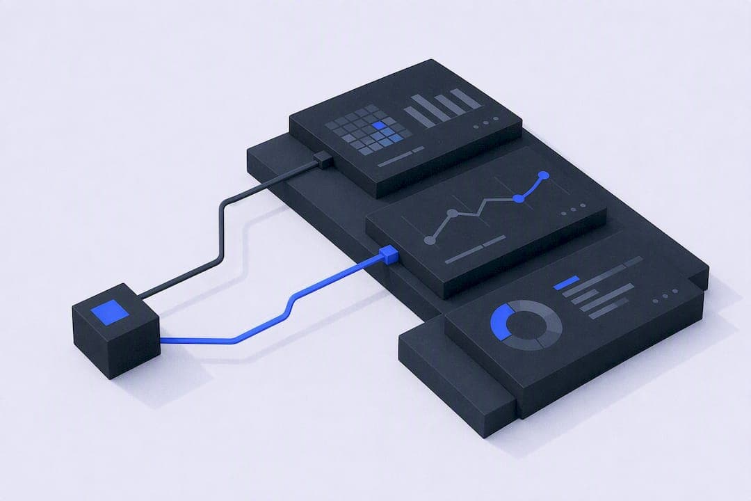
A real-time dashboard pulls live data into a visual interface that refreshes automatically, usually within seconds, so teams can see what's happening right now instead of what happened yesterday. Use one when a delay of even a few minutes would cost you money, break an SLA, or leave an incident unnoticed. If your team can act on hourly or daily reports, skip the added complexity. If a stakeholder needs sub-minute visibility to make a call, a real-time dashboard is the right tool.
TL;DR:
- Real-time dashboards should refresh every few seconds to minutes depending on the metric's volatility, with incident monitoring requiring 5 to 15 seconds.
- Building an effective dashboard involves clarifying desired decisions, verifying data access, and modeling a current-state view before assembling visual tiles.
- Use different designs for wall displays and analyst views to ensure clarity for broad-room monitoring versus detailed filtering needs.
- Push, poll, or streaming architectures impact dashboard latency, with streaming CDC pipelines providing sub-100 millisecond updates for high-volume data.
- Vetros automates data ingestion, modeling, and visualization, suitable for teams without dedicated data engineers seeking decision-grade, live metrics with minimal setup.
Table of Contents
- Types of Real-Time Dashboards and When to Use Each
- How Do You Build a Real-Time Dashboard?
- What Makes a Real-Time Dashboard Actually Usable?
- Technical Architecture: Push, Poll, and Streaming Trade-Offs
- Templates You Can Adapt for Your Team
- Keeping a Live Dashboard From Going Stale
- How Vetros Handles the Engineering Burden Behind Live Dashboards
- Walls vs. Analyst Views: A Pragmatic Take
- Ready to Build a Live Dashboard Without the Pipeline Headache?
- Sources
- FAQ
Types of Real-Time Dashboards and When to Use Each
Not every live dashboard should look or behave the same way. The right pattern depends on who's watching it and what they're supposed to do when something changes.
Operational walls run on a shared screen, usually in an ops room or on a TV mounted near a support desk. Nobody clicks into them. They're built for glance-and-react monitoring, which means fewer metrics, bigger fonts, and almost no interactivity. Analyst dashboards, by contrast, are built for someone sitting at a desk who wants to filter, drill down, and cross-reference. They can hold more density because the viewer is actively engaging, not glancing from across a room.
Here's how that split plays out across common use cases:
- Incident monitoring / SRE dashboards: active incident count, error rate, p95/p99 latency, deployment frequency, on-call acknowledgment time. Refresh every 5 to 15 seconds. These are almost always operational walls.
- Sales and revenue tracking: live orders, revenue run rate, conversion rate over a rolling window, average deal size, pipeline velocity. Refresh every 30 to 60 seconds. Works as either a wall or an analyst view depending on the team.
- Support and fulfillment: open ticket count, SLA breach warnings, average first-response time, agent utilization, backlog age. Refresh every 15 to 30 seconds.
- Inventory and logistics: units on hand, reorder alerts, orders per minute, picking backlog, shipment exceptions. Refresh every 1 to 5 minutes, since inventory rarely needs sub-minute precision.
- Financial and KPI walls: cash position, daily recurring revenue, churn signals, budget burn against forecast. Refresh every few minutes; these numbers move slower and don't need aggressive polling.
The mistake teams make is copying a KPI-wall layout onto an analyst dashboard, or vice versa. A wall crammed with filters confuses the room. An analyst view with only five giant numbers wastes the screen real estate someone actually wants to use.
How Do You Build a Real-Time Dashboard?
Building a working live dashboard is less about picking flashy visualization software and more about getting the data pipeline right before you touch a chart. Microsoft's own walkthrough for creating a real-time dashboard in Fabric lays out prerequisites, data source setup, and tile creation in roughly this order, and it holds up as a general pattern regardless of platform.
- Define the objective and the metrics that prove it. Decide what decision this dashboard supports before picking a single chart type. "Monitor checkout health" is not a metric; "cart abandonment rate over a 10-minute rolling window" is.
- Inventory your data sources and confirm access. List every API, webhook, or database you'll need, then verify authentication actually works before you build anything visual. This step kills more projects than any technical limitation, because auth tokens expire, IT gatekeeps database credentials, and API rate limits surface only under load.
- Choose your ingestion pattern. Webhooks and push-based feeds are simplest when the source supports them and volume is moderate. Change data capture (CDC) suits databases where you need every row-level change without hammering the source with queries. Streaming connectors, as Estuary describes in its overview of CDC and streaming ETL, fit high-volume, continuous event flows and can deliver updates in under 100 milliseconds when the pipeline is managed well.
- Model a current-state view. Raw event streams aren't dashboard-ready. Build a materialized view or a "latest state" table that always reflects the newest known value per entity, so your frontend queries something fast and simple instead of recomputing aggregates on every refresh.
- Assemble your tiles. Pick one widget per metric, decide whether it updates via live push or scheduled poll, and add a visible "last updated" timestamp or pulse indicator so viewers trust what they're seeing.
- Deploy a pilot and watch the pipeline, not just the dashboard. Ship one source, one tile, and confirm latency end to end before expanding scope.
Pro Tip: Start with a single source and a single tile. Measure the actual delay from event to screen before you add a second metric. It's far easier to diagnose one pipeline than to untangle five at once when something breaks.
Power BI's documentation on push, streaming, and pub/sub dataset models is worth reading even if you're not on that platform, because the distinctions it draws (whether data lands in storage first, whether the visual updates automatically, or whether you need a manual refresh) apply to nearly every real-time BI tool on the market.
What Makes a Real-Time Dashboard Actually Usable?
A dashboard that updates every second isn't automatically useful. Plenty of live dashboards fail not because the data is wrong, but because the design buries the one number that matters under six others that don't.
- One clear metric per tile. Resist the urge to overlay three lines on one chart just because you can. Pair each number with a baseline or a delta, like "+12% vs. last hour," so the viewer has context without hunting for it.
- Set refresh cadence on purpose, not by default. A metric that changes twice a day doesn't need a five-second poll; it just adds server load and gives a false sense of freshness. Match the cadence to how fast the underlying number actually moves and how fast someone can realistically act on it.
- Signal "live" visually, but don't overdo it. A small pulsing dot or a timestamp works. Constant animation across every tile makes it harder, not easier, to spot the change that actually matters.
- Pair thresholds with alerts, and tune them. A dashboard tile that turns red is useful. A dashboard tile that turns red every ten minutes because the threshold is too tight trains people to ignore it, which defeats the entire purpose of building this in the first place.
- Design ambient walls and analyst views differently. Walls need oversized type, high contrast, and minimal color variation so they read from across a room. Analyst dashboards can use smaller fonts and denser color coding because the viewer is close enough to read detail.
Pro Tip: If you're not sure whether a metric belongs on the wall or in the analyst view, ask whether someone would ever filter it. If yes, it belongs in the analyst dashboard, not the wall.
Technical Architecture: Push, Poll, and Streaming Trade-Offs
The architecture decision that shapes everything else is push versus poll. Polling means your dashboard asks the data source for updates on a fixed interval, which is simple to build but wastes resources when nothing has changed and introduces lag equal to your polling interval. Push means the source notifies your dashboard the moment something changes, usually through WebSockets or server-sent events, which cuts latency and load but adds complexity on both ends.
Change data capture bridges the gap for database-backed systems. Instead of querying a production database repeatedly (which risks locking tables or slowing transactional workloads), CDC tools tail the database's transaction log and stream only the changes. Estuary's platform, built around CDC and streaming ETL, claims managed CDC pipelines can deliver changes with sub-100ms latency, which is fast enough for most operational dashboards without the fragility of hand-rolled polling scripts.
On the frontend, Next.js and similar frameworks now support a pattern where server components render the initial dashboard state fast, while client components subscribe separately to a live feed for updates after load. That split matters at scale: rendering an entire page on every incoming event is what causes dashboards to freeze or stutter when data arrives in bursts. Throttling updates to the browser's paint cycle rather than firing a render on every single event keeps the UI responsive even under heavy load.
For storage, most real-time dashboards rely on one of three patterns:
- Current-state tables that overwrite the latest value per key, ideal for simple status views.
- Materialized views that pre-aggregate rolling windows so the frontend never computes averages on the fly.
- Low-latency OLAP stores built for fast scans across high-cardinality data, useful when you're slicing metrics by dozens of dimensions at once.
Watch cardinality closely. A metric broken down by customer ID across millions of customers will choke most visualization layers long before the backend struggles. Measure end-to-end latency, not just query time, by timestamping the event at its source and comparing it to the moment it renders on screen.
Templates You Can Adapt for Your Team
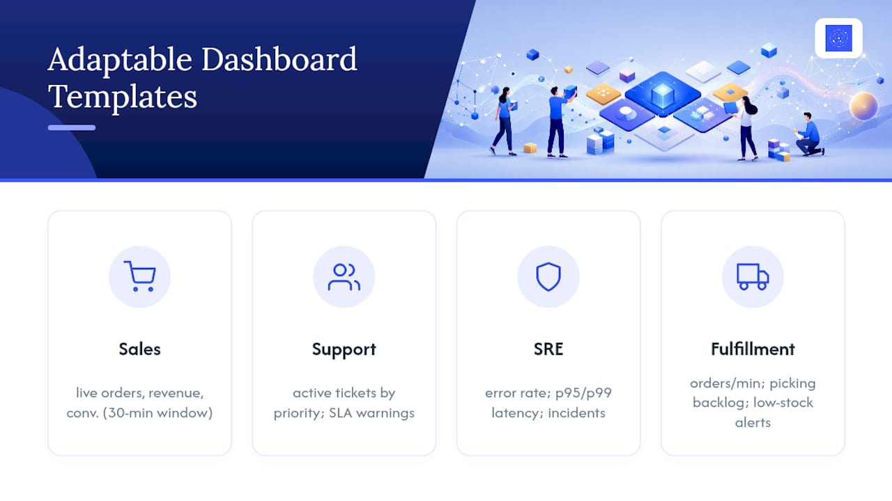
Copying a rough layout beats designing from a blank canvas. These four templates cover the use cases that come up most often.
Sales and revenue dashboard: live order count, revenue run rate, conversion rate over a rolling 30-minute window, average order value, refund rate. Refresh orders and revenue every 30 to 60 seconds; refresh conversion rate slightly slower since it needs more data to stabilize.
Support and operations dashboard: active ticket count by priority, SLA breach warnings, average time to first response, agent capacity remaining. This one benefits from color thresholds more than any other template, since a single breached SLA often needs immediate escalation.
SRE and reliability dashboard: error rate, request latency at p95 and p99, active incident count, deployment frequency. Keep this one dense and analyst-facing; the audience wants precision over ambiance.
E-commerce fulfillment dashboard: orders per minute, picking backlog size, inventory alerts for low-stock SKUs, shipment exception count. This template rewards a slightly slower refresh, since inventory counts that update every second usually just add noise without adding insight.
None of these templates are fixed. Swap metrics based on what your team actually escalates on, and cut anything nobody has referenced in the last month.
Keeping a Live Dashboard From Going Stale
A dashboard that quietly stops updating is worse than no dashboard at all, because people keep trusting a number that stopped changing hours ago.
- Build automated pipeline health checks. Alert on ingestion failures separately from alerting on the business metrics themselves; a silent pipeline break should never be diagnosed by someone noticing the chart "looks flat."
- Gate schema changes. A renamed field or a dropped column upstream can silently break a live feed. Require a staging check before any schema change reaches production dashboards.
- Assign a named owner per dashboard. Every live dashboard needs someone responsible for its runbook, its alert thresholds, and its data source relationships, not a vague "the data team" attribution.
- Control cardinality and retention. Trim historical granularity on older data and cap the dimensions you track live, since unmanaged cardinality is one of the fastest ways real-time systems become expensive without becoming more useful.
How Vetros Handles the Engineering Burden Behind Live Dashboards
Everything covered above (data source connections, ingestion pattern selection, modeling a current-state view, ongoing pipeline health) is exactly the work that keeps small teams from ever shipping a real-time dashboard in the first place. Vetros was built to automate that chain: you describe what you want to see, and the platform connects to your data sources, manages ingestion and modeling, and builds and maintains the dashboard itself.
That approach fits certain situations especially well:
- Teams without a dedicated data engineer who still need live, decision-grade metrics.
- Organizations that need to see and modify the underlying code themselves, rather than trusting a black box.
- Businesses that care about data privacy and traceability, since every pipeline stays visible and auditable rather than hidden inside someone else's infrastructure.
During onboarding, expect to point Vetros at your first data source and describe the metric you care about in plain language, mirroring the single-source pilot approach outlined earlier in this article.
Walls vs. Analyst Views: A Pragmatic Take
Most teams overbuild their first dashboard. Start with one metric, one source, one tile. Validate that the pipeline holds up under real load before adding a second widget. Use ambient walls only for metrics a room needs to react to instantly; keep everything else in an analyst view where filtering matters more than glanceability. The three pitfalls that sink most first attempts: chasing refresh speed nobody needs, skipping pipeline monitoring until something breaks, and building for an audience that was never asked what they'd actually use.
— Ąžuolas
Ready to Build a Live Dashboard Without the Pipeline Headache?
Vetros replaces the weeks of pipeline engineering this article just walked through with a single conversation: describe the metric, connect the source, and the platform handles ingestion, modeling, and visualization on its own.
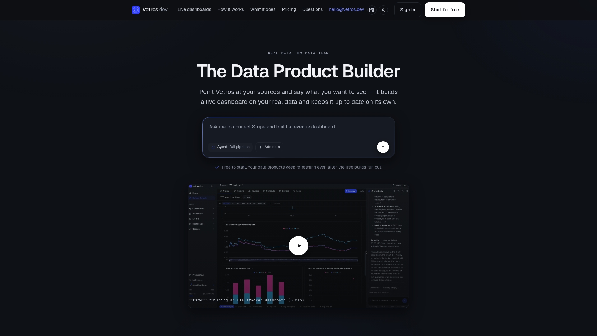
That matters most for teams without a dedicated data engineer, since the usual alternative is either hiring one or living with static spreadsheets updated by hand. Start with the Free plan to test one source and one dashboard, then move to Pro at $99 per month or Team at $349 per month as your source count and refresh needs grow; Enterprise pricing is available on request. Connect your first source today and see a working pilot dashboard before you commit to anything.
Sources
FAQ
What Is a Real-Time Dashboard?
A real-time dashboard is a visual interface that displays data as it updates, typically refreshing within seconds rather than on a scheduled report cycle. It's built for situations where immediate situational awareness drives faster decisions, like monitoring live orders or active system incidents.
What Is an Example of Real-Time Monitoring?
An SRE team watching error rates, request latency, and active incident counts on a shared screen is a common example, with metrics refreshing every 5 to 15 seconds. Live order tracking on an e-commerce fulfillment dashboard is another, since staff need to react to backlog spikes within minutes, not hours.
What Is Real-Time Data Visualization?
Real-time data visualization is the practice of rendering charts, counters, or tiles that update automatically as new data arrives, instead of requiring a manual refresh. It typically relies on push mechanisms like WebSockets or streaming connectors so the screen reflects the current state without a page reload.
How Do I Choose the Right Refresh Rate?
Match the refresh interval to how fast the metric genuinely changes and how quickly someone can act on it. A checkout error rate might need a 5 to 15 second refresh, while a daily revenue total refreshing every few minutes is plenty.
Does Vetros Require a Data Engineering Team to Build a Dashboard?
No. Vetros connects to your data sources and manages ingestion, modeling, and visualization automatically once you describe what you want to see. Current pricing for the Free, Pro, and Team plans is listed on the Vetros site, with Enterprise pricing available on request.