

A product analytics dashboard is a live view of your North Star metric and the handful of indicators that drive it, built so a team can make one decision faster. Its job is not to display data. It's to trigger action. A dashboard succeeds when it's timely enough to catch a shift, focused enough that nobody has to hunt for the number that matters, and specific enough to tell someone what to do next.
TL;DR:
- Real-time dashboards for launch monitoring should focus on error rates, crash-free sessions, and feature adoption, refreshed continuously for 24 to 72 hours.
- Most dashboards should prominently display a single North Star metric and two to three key influencers, with granular levers kept hidden unless needed for troubleshooting.
- Limiting dashboards to nine metrics or fewer reduces scroll fatigue and helps decision-makers focus on the most impactful data.
- Regularly review and remove unused metrics, and recalibrate alert thresholds to prevent alert fatigue and maintain team trust.
- Autonomous platform solutions can automate data ingestion and refreshes, allowing teams to create live dashboards using plain language descriptions without extensive data engineering.
Table of Contents
- Product Analytics Dashboard Types and When Each One Earns Its Spot
- Choosing Metrics: the North Star, Key Influencers, and Levers
- Dashboard Design: Why Fewer Metrics Beat More Metrics
- How to Build a Product Analytics Dashboard, Step by Step
- Dashboard Templates Product Teams Can Copy Directly
- The Pitfalls That Quietly Kill Dashboard Trust
- When an Autonomous Dashboard Platform Solves the Maintenance Problem
- What I'd Fix First on Any Dashboard
- Get a Live Dashboard Without Building a Data Team First
- Sources
- FAQ
Product Analytics Dashboard Types and When Each One Earns Its Spot
A dashboard and a report solve different problems, and confusing them is why so many "analytics dashboards" turn into ignored PDFs. A report tells a story after the fact. A dashboard exists to answer a live question, over and over, for a team that needs the same view every day or every hour. Kissmetrics argues that dashboards should be built around the questions a team actually asks, not around whatever metrics happen to be easy to pull.
That framing splits naturally into four dashboard types, each with a different audience and refresh rhythm:
- Executive health dashboards answer "is the business on track?" for leadership, refreshed weekly or monthly.
- Product health dashboards answer "is the product working for users?" for product teams, refreshed daily.
- Experiment monitoring dashboards answer "is this test doing what we hoped?" for the team running an A/B test, refreshed in near real time during the test window.
- Launch operations dashboards answer "is today's release stable?" for the on call team, refreshed continuously for the first 24 to 72 hours after ship.
Mapping cadence to decision urgency this way prevents the common mistake of putting a slow, weekly metric next to a real-time alert. If nobody acts on it within the hour, it doesn't belong on an hourly view.
Choosing Metrics: the North Star, Key Influencers, and Levers
Most dashboards fail because they try to show everything instead of what moves the business. The fix is a three-tier structure. ProductPlan's SaaS product metrics pyramid puts a single North Star metric at the top, backed by two or three key influencers, with a wider set of granular levers underneath for troubleshooting.
The North Star is the one number that represents value delivered, things like weekly active teams completing a core workflow, or net revenue retained. Below it sit the key influencers, the two or three metrics tied to whatever initiatives are currently on the roadmap. If your team is investing in onboarding right now, activation rate is a key influencer. If nobody is actively working on referral loops, viral coefficient probably shouldn't occupy that slot even if it's an interesting number.
Levers are the diagnostic layer: adoption rate by feature, DAU/WAU/MAU ratios, NPS trend, support ticket volume. You pull these up when a key influencer moves and you need to know why, not because they deserve permanent screen space.
- North Star: one metric, always visible, always the largest element on the screen
- Key influencers: two to three metrics tied to active initiatives
- Levers: granular metrics used for root cause work, often hidden until needed
ProductPlan's own guidance is blunt about the filter to apply here: if you're not taking actions that move a metric, it doesn't belong on the primary dashboard. That single rule eliminates most of the clutter that accumulates on dashboards over a year of well meaning additions.
Dashboard Design: Why Fewer Metrics Beat More Metrics
Dashboard design is really attention management. People can track roughly 5 to 9 metrics at once before performance drops off, and a dashboard that ignores this limit doesn't inform anyone, it just produces scroll fatigue.
That number sets a hard design constraint: if a single audience genuinely needs more than nine metrics, the answer is to split the view into two dashboards by decision owner or cadence, not to shrink the font and cram everything onto one screen.
Layout should reflect the pyramid directly. The North Star gets the top left corner or the largest visual element, since that's where eyes land first. Key influencers sit in a middle row, sized smaller but still prominent. Levers live below the fold or behind a click, available on demand rather than competing for attention.
- Use RAG (red/amber/green) status indicators sparingly, and assign them manually rather than by rigid formula, so a judgment call sits behind every color.
- Require a commentary field on every dashboard. A number alone doesn't explain a dip. PMRead's product health template builds this in as a mandatory section precisely because commentary is what turns a chart into a decision.
- Avoid using red or green as the only signal of good and bad. Pair color with a label or icon so the dashboard still reads correctly for colorblind viewers.
Pro Tip: Before you add a metric to the top row, ask who will change their behavior because of it. If nobody can answer that question in one sentence, the metric belongs one tier down or off the dashboard entirely.
How to Build a Product Analytics Dashboard, Step by Step
Building a dashboard that survives contact with real usage takes more than picking a chart tool. Here's the sequence that avoids most of the rework:
- Inventory your data sources. List every system holding user or product data (your app database, billing system, support tool, CRM) and decide how you'll resolve identity across them, since person-level analysis breaks down if a user looks like three different people across three tools.
- Define canonical events and properties. Write down exact names and definitions for events like "signup completed" or "feature activated" before anyone builds a chart. Definition drift, where two teams mean different things by "active user," is the single most common source of dashboard distrust.
- Pick your refresh cadence deliberately. Real-time refresh makes sense for launch monitoring and active experiments; daily refresh is plenty for retention and revenue metrics, and it costs far less to maintain.
- Set alert thresholds from historical baselines. A common approach sets a warning at the 10th percentile of historical performance and a critical alert only at levels the metric has never hit before, then reviews thresholds after 30 days to cut down on false alarms.
- Validate before calling it authoritative. Cross-check dashboard numbers against a raw export, confirm the commentary field is actually being filled in, and get one skeptical stakeholder to try to break it before rolling it out team-wide.
A reliable stack behind all of this typically combines product analytics, visualization, session recording, and feedback tools that can pull from the same underlying data and support both auto-refresh and alerting without manual babysitting.
- Assign one owner per data source who's responsible when a pipeline breaks.
- Document every event definition in a shared, versioned location, not a person's memory.
- Test the dashboard with someone who wasn't involved in building it.
Dashboard Templates Product Teams Can Copy Directly
Three templates cover most product team needs, and each one maps to a different audience and cadence.
The product health snapshot is the workhorse. PMRead's free template structures it around eight sections: acquisition, activation, retention, revenue, engagement, NPS and support, system reliability, and a commentary field that's mandatory, not optional. This view refreshes daily and serves the whole product team, not just leadership.
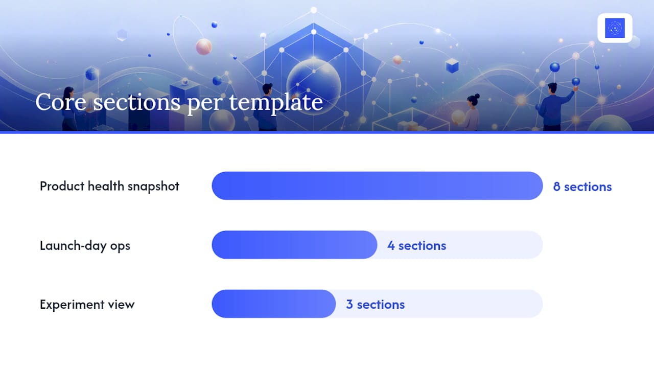
The launch-day operations view strips everything down to what matters in the first 72 hours after a release: error rates, crash-free sessions, adoption of the new feature, and support ticket volume tied to the release tag. This refreshes continuously, and the on-call engineer or launch owner watches it directly, not through a weekly digest.
The experiment dashboard tracks a single test: the primary conversion funnel, key segments (new versus returning users, platform, geography), and pre-registered guardrail metrics you agreed to check before the test started, so nobody moves the goalposts mid-experiment.
| Template | Primary audience | Refresh cadence | Core sections |
|---|---|---|---|
| Product health snapshot | Product team, cross-functional stakeholders | Daily | Acquisition, activation, retention, revenue, engagement, NPS, reliability, commentary |
| Launch-day ops | On-call engineer, launch owner | Real time | Error rate, crash-free sessions, feature adoption, support tickets |
| Experiment view | Experiment owner, data analyst | Real time during test window | Funnel, segments, guardrail metrics |
Split any of these by audience when the metric count creeps past nine for one group, and keep RAG status and commentary fields in every version regardless of template.
The Pitfalls That Quietly Kill Dashboard Trust
Metric sprawl is the most common failure mode. Dashboards accumulate metrics the way inboxes accumulate subscriptions, one reasonable addition at a time, until nobody can find the number that actually matters. Run a metric audit every quarter: for each metric, ask who looked at it last week and what they did differently because of it. If the answer is nobody and nothing, remove it.
Alert fatigue follows a similar pattern. Thresholds set once and never revisited eventually fire constantly on normal variance, and teams learn to ignore every alert, including the real ones. Recalibrate thresholds against actual historical performance on a fixed schedule rather than leaving them static forever.
- Assign a single owner for writing commentary on each dashboard section, and a separate owner responsible for acting on alerts, so accountability doesn't fall through the cracks between the two.
- Keep a versioned data dictionary that records exactly how each metric is defined and when the definition last changed, which prevents the classic problem of two teams reporting different numbers for "active users."
Pro Tip: If two people on your team would define "active user" differently right now, fix that before you fix anything about the dashboard's layout. No amount of visual design solves a definition problem.
When an Autonomous Dashboard Platform Solves the Maintenance Problem
Most of the checklist above assumes someone maintains pipelines, event definitions, and refresh logic over time, and that's exactly where small teams run out of capacity. Some autonomous dashboard platforms build and maintain real-time dashboards automatically, without requiring a dedicated data team, by connecting directly to data sources and handling ingestion and modeling themselves.
Instead of writing queries, you describe what you want to see in plain language, which shortens time-to-insight considerably compared to a manual build cycle. Some autonomous dashboard platforms also keep the underlying code visible and editable, so teams retain traceability into how a metric is calculated rather than trusting a black box. This fits startups, analysts, and non-technical teams best, less so organizations that already run a full data engineering function.
What I'd Fix First on Any Dashboard
If I inherited a struggling dashboard tomorrow, I wouldn't redesign it. I'd pick one decision it's supposed to support and check whether that decision actually got made last week. Then I'd assign an owner who writes commentary every Monday, and I'd cut every metric nobody has acted on in the last month. Most dashboard problems are ownership problems wearing a visualization costume. Pairing that discipline with a focused AI tool built for product managers can speed up the audit itself, but it won't replace the judgment call about what to cut.
Get a Live Dashboard Without Building a Data Team First
Certain dashboard platforms serve the teams this article is written for: product managers and analysts who need the North Star, key influencers, and RAG commentary described above, without hiring a data engineer to build and babysit the pipeline. You describe the dashboard in plain language, some platforms connect to your sources, handle ingestion and modeling, and keep the view refreshed on the cadence you set, whether that's real time for a launch or daily for retention tracking.
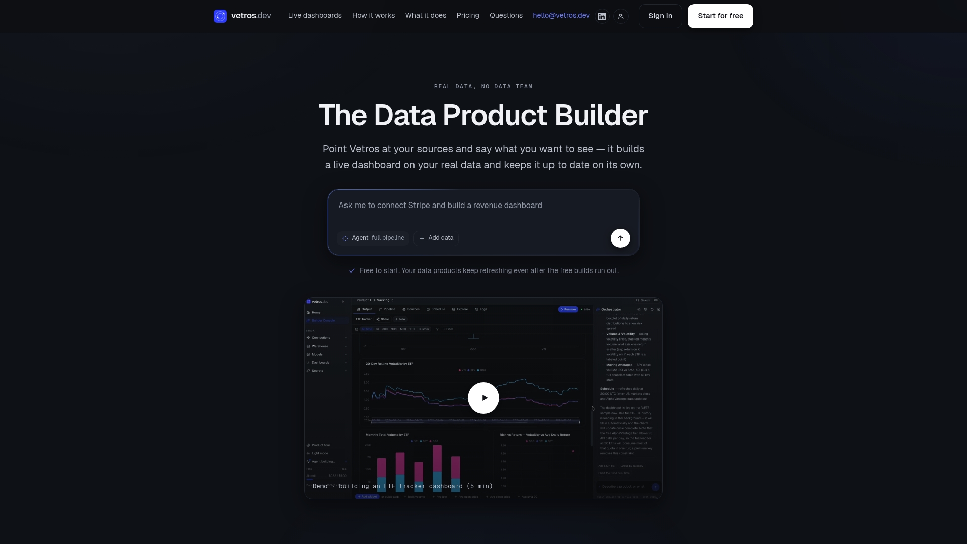
That maps directly onto the build checklist above: source inventory, event definitions, refresh cadence, and alerting are the parts Vetros automates, while you focus on which metrics actually belong on the screen. If you want to see what a live product health snapshot looks like without writing a single query, start with the Vetros dashboard platform and describe the first view you need.
Sources
For a deeper look at the metric pyramid, see ProductPlan's guide. For a ready-made layout, PMRead's free template is a solid starting point to adapt, not copy verbatim.
- The SaaS Product Metrics Pyramid | ProductPlan
- KPI dashboard best practices (ClearPoint Strategy)
- Free Product Health Dashboard for Product Managers | PMRead
- The Complete Guide to SaaS Product Analytics: Metrics That Actually Drive Growth | Kissmetrics
- 10 Key SaaS Product Metrics to Track (+ Best Practices for Measuring) | Chameleon
FAQ
What Are the Four Types of Dashboards?
Product teams typically use four types: executive health dashboards for leadership, product health dashboards for daily team use, experiment monitoring dashboards for active tests, and launch-day operations dashboards for release monitoring. Each serves a different audience and refresh cadence, from monthly reviews to real-time tracking.
How Do I Create a Product Analytics Dashboard?
Start by inventorying your data sources and defining canonical event names, then choose a refresh cadence, set alert thresholds from historical baselines, and validate the numbers before treating the dashboard as authoritative. Platforms like Vetros can automate the ingestion and modeling steps for teams without a dedicated data engineer.
What Is Product Analytics?
Product analytics is the practice of tracking how users interact with a product, including which features they use, where they drop off, and what drives retention and revenue. It differs from general web analytics by focusing on person-level behavior inside the product rather than aggregate traffic.
What Are the Top Dashboard Tools?
There's no single fixed list, since the right tool depends on team size and technical resources. A reliable stack generally combines product analytics, visualization, session recording, and feedback tools that integrate with each other, and teams without a data team increasingly choose autonomous platforms like Vetros that handle the modeling layer directly.
How Many Metrics Should a Dashboard Show?
Most dashboard design guidance recommends 5 to 9 visible metrics per audience, since that's roughly the limit people can track effectively at once. If one audience genuinely needs more, split the view into two dashboards by decision owner rather than adding rows to a single screen.