

A founder dashboard is a single screen showing the 8 to 12 metrics that tell you whether your business is healthy and what needs your attention right now. Check it daily or weekly, glance at the trend lines and owner notes, and act on whatever is off-target. That is the whole job. It is not a reporting archive; it is a decision surface.
TL;DR:
- Founders should focus on 8 to 12 key metrics that directly influence decisions, avoiding overloading the dashboard with less relevant data.
- Regular reviews should assign clear owners to each metric and occur at frequencies aligned with the data's movement speed, such as weekly or monthly.
- Building a dashboard step-by-step ensures accountability, data source mapping, and a simple layout, with the decision queue as the first focus area.
- Automated platforms like Vetros can maintain live dashboards with minimal upkeep, reducing manual updates and enhancing trustworthiness.
- Retiring stagnant metrics and revisiting the list quarterly keeps the dashboard relevant for ongoing decision-making.
Table of Contents
- What Is a Founder Dashboard, and What Types Exist?
- The 8-12 Metrics Founders Should Actually Watch
- How Do You Build a Founder Dashboard Step by Step?
- Who Owns Each Metric, and How Often Should You Review It?
- Where Can You Get a Founder Dashboard Template?
- When an Autonomous Platform Beats a DIY Dashboard
- A Founder's Checklist for Keeping a Dashboard Useful
- A More Honest Option for Founders Without a Data Team
- Sources
- FAQ
What Is a Founder Dashboard, and What Types Exist?
The goal is deciding, not archiving. A good founder dashboard answers "what should I work on today?" in the time it takes to drink a coffee. A reporting deck, by contrast, exists to document what already happened for a board meeting three weeks from now. Those are different tools with different refresh rates, and confusing them is why so many dashboards get built once and never opened again.
Most founders end up choosing among four formats:
- Executive/CEO dashboard: a single-page view of 5 to 7 top-line numbers (revenue, cash, growth rate) refreshed daily or weekly, built to answer "how is the business doing?" for leadership and board members.
- Operational dashboard: tracks the day-to-day machine, delivery timelines, support queues, ops capacity, usually refreshed daily.
- Product/engagement dashboard: activation, retention, feature usage, reviewed weekly to catch drop-off before it becomes a trend.
- Decision queue: not metrics at all, but a running list of open decisions and blockers waiting on you, refreshed continuously.
Most early-stage founders need the executive view and a decision queue. Add the other two once a specific function (ops or product) grows a team that needs its own visibility.
The 8-12 Metrics Founders Should Actually Watch
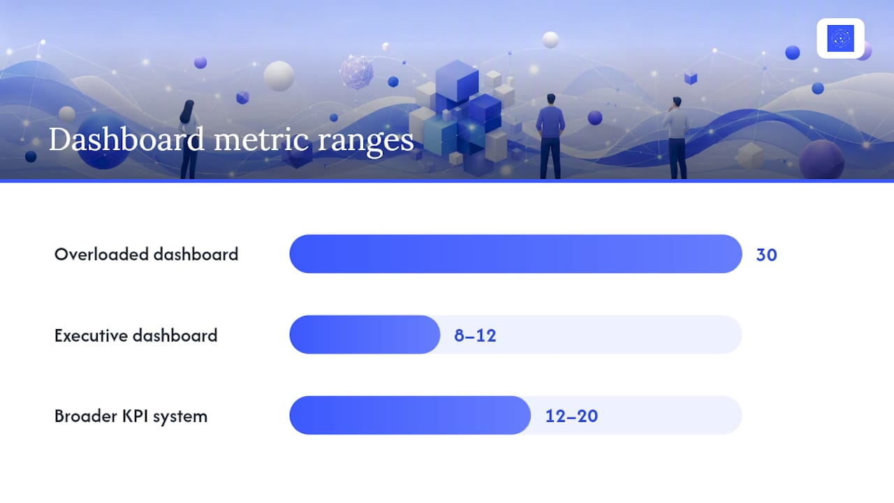
Cramming 30 metrics into a dashboard doesn't make you more informed. It makes you skim past all of them. Executive dashboards that actually get used stay in the 8 to 12 metric range; broader KPI systems can run 12 to 20, but that's a different tool for a different audience.
Pro Tip: If you can't explain what action a metric would trigger if it dropped 20% overnight, it doesn't belong on the founder dashboard. Move it to a departmental report instead.
Here's a shortlist that covers the categories that matter most:
- Revenue (MRR or monthly revenue, whichever fits your model)
- Runway and cash burn (months of cash left at current spend)
- Contribution margin (are you making money on each unit or customer?)
- New MRR or new orders (the growth engine, not the accumulated total)
- Pipeline velocity (deals moving, not just deals open)
- CAC signal (spend per acquired customer, even a rough proxy)
- Activation rate (percentage of new users hitting first value)
- Retention or churn (cohort based, not a single blended number)
- NPS or CSAT (a pulse check on whether customers are still happy)
- Open blockers (what's stuck and who's waiting)
- Team capacity (are people overloaded or underused)
- Major open decisions (the short list only you can resolve)
Split these into leading and lagging indicators. Revenue and churn are lagging: they tell you what already happened. Activation, pipeline velocity, and open blockers are leading: they tell you what's about to happen. A dashboard weighted entirely toward lagging numbers reads like a rearview mirror. You want at least half your metrics giving you a warning before the damage shows up in revenue.
How Do You Build a Founder Dashboard Step by Step?
Building this well takes an afternoon, not a sprint. Here's the sequence that avoids the usual dead ends.
- Pick your 8 to 12 metrics and name an owner for each one. No owner means no accountability, and an unowned metric is the first thing that goes stale.
- Map every metric to its actual data source (Stripe, your CRM, your product analytics, a spreadsheet someone updates manually) and write down how often that source refreshes. A metric can't update faster than its source does.
- Choose your build method based on what you actually have. A shared spreadsheet works for a two-person team. A wiki embed or lightweight BI tool works once you have several data sources feeding the same view. An autonomous dashboard platform removes the maintenance step entirely once you're tired of rebuilding charts by hand.
- Lay it out for a five-second read. One screen, no scrolling. Every metric gets a target, a trend line, a last-updated timestamp, and a red/yellow/green status. ClickUp's research on CEO dashboards found that five focused views, company health, delivery risk, capacity, goals, and the decision queue, can replace most recurring status meetings when each view is readable in under a minute.
- Test it for trust before you lock the cadence. Show it to a cofounder or advisor and ask what they'd change. If a metric gets ignored for two review cycles in a row, cut it.
Pro Tip: Build the decision queue view first, even before your revenue numbers. It's the one part of the dashboard that changes daily and forces you to open the thing.
Who Owns Each Metric, and How Often Should You Review It?
A dashboard without an owner is a chart nobody feels responsible for. Every metric needs a named person attached to it, not "the team," and that name should sit right next to the number. Pair it with a last-updated date, and stale data becomes obvious instead of silently misleading you.
Review cadence should match how fast the underlying number actually moves:
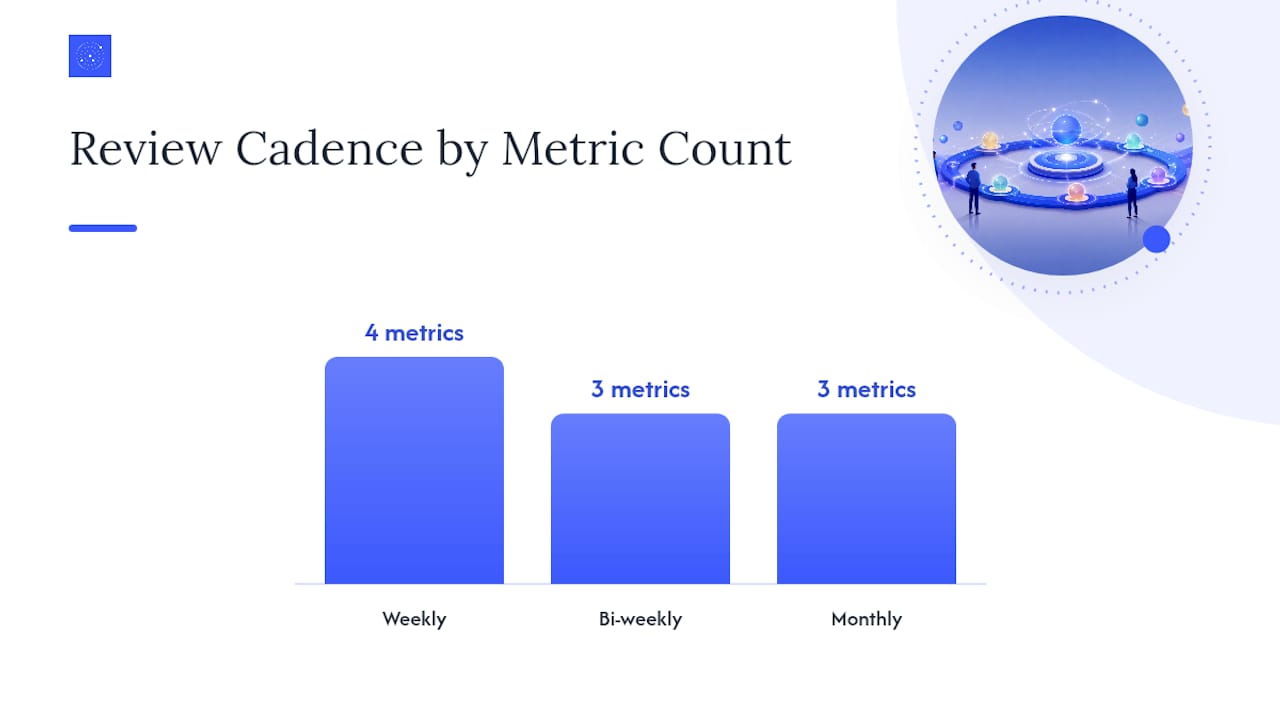
- Weekly: revenue, new MRR, pipeline velocity, open blockers.
- Bi-weekly: activation, retention cohorts, capacity.
- Monthly: runway, contribution margin, and NPS/CSAT.
Every metric on the dashboard should carry a target, an owner, a last-updated timestamp, and a trend line. ClearPoint Strategy's research on executive dashboards found that without those four elements, a number becomes stale and stops being trusted, which is the fastest way a founder dashboard turns into a chart nobody opens.
The most common failure isn't picking the wrong metrics. It's picking too many, loading up on lagging indicators that only confirm what already went wrong, and never assigning a next action to any of them. A useful decision rule: if a metric moves and nobody's job description changes as a result, cut it.
Where Can You Get a Founder Dashboard Template?
You don't need custom engineering to get a working dashboard live this week. Match the template to what you already have.
- Spreadsheet templates work well for pre-revenue and early-stage teams pulling numbers manually from two or three sources.
- Wiki or Notion embeds suit teams that already live in a shared workspace and want the dashboard next to their docs.
- Marketing and campaign templates, like the reporting formats Influenna documents for influencer campaigns, are useful models if a chunk of your growth metrics come from paid or creator partnerships.
- Lightweight BI tools fit once you have four or more live data sources and manual copy-paste starts eating an hour a week.
Before you adopt any template, check four things: how it refreshes, who owns it, who has edit access, and whether it's readable on a phone. Upgrade to an automated platform the moment manual updates start slipping.
When an Autonomous Platform Beats a DIY Dashboard
DIY works until the maintenance cost exceeds the insight it produces. Spreadsheets and embeds are fine when one person owns them and updates are quick. The moment you're chasing five data sources by hand, or a metric goes stale because whoever owned it got busy, the dashboard stops being a decision surface and starts being a chore.
Vetros was built for exactly that gap. Describe the metrics you want in plain language, and Vetros connects to your data sources, handles ingestion and modeling, and keeps the dashboard live without a data engineer on staff. Because the underlying code stays readable and editable, you get traceable data lineage instead of a black box, which matters once investors start asking where a number came from. If your team is spending more time updating charts than acting on them, that's the signal to hand the maintenance off.
A Founder's Checklist for Keeping a Dashboard Useful
Revisit your metric list every quarter, not just when something breaks. Retire anything that hasn't triggered a decision in two straight review cycles, and separate the numbers your investors want from the ones you actually run the company on. For small teams, automate the refresh before you automate anything else. Manual updates are the first thing to slip, and a dashboard that lies by omission is worse than no dashboard at all.
— Ąžuolas
A More Honest Option for Founders Without a Data Team
There are other routes here: a shared spreadsheet someone updates by hand, a BI tool your first hire configures, or a wiki embed you patch together on a weekend. All of them work until the update burden outpaces the value. There are alternatives for founders who want the second path, a dashboard that stays live without anyone owning the upkeep.
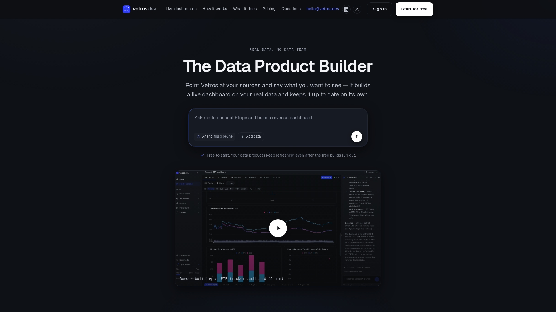
Tell Vetros what you want to see, in plain language, and it connects to your existing data sources, handles the modeling, and keeps every chart current on its own. No data hire, no weekend spent wiring up a BI tool, and because the code behind each dashboard stays readable, you can check exactly where a number came from instead of taking it on faith. That combination matters most for founders running lean: fewer hours lost to chart maintenance, more time spent on what the numbers are actually telling you. Start a free trial at Vetros and get your first live dashboard running this week.
Sources
For deeper reading on dashboard design and governance, see the executive dashboard guides from AppDeck, GenerateKPI, and Atlassian.
- Executive Summary Dashboard: Complete Guide with Examples 2026
- Executive KPI Dashboard Template: What to Include, How to Structure It, and Why Most Fall Short
- 13 Executive Dashboard Examples — 4 Numbers They Get Wrong (2026) | ClearPoint Strategy Blog
FAQ
What Should a Founder Dashboard Include?
A founder dashboard should include 8 to 12 metrics covering revenue, cash runway, growth signals, product engagement, and open operational blockers, each with a target, an owner, and a last-updated date.
What Are the Four Types of Dashboards?
The four common types are executive/CEO dashboards, operational dashboards, product or engagement dashboards, and decision queues, each answering a different question at a different refresh rate.
What Is the Five-Second Rule for Dashboards?
A well-designed dashboard should let a reader grasp the key status of the business within about five seconds, which is why one-screen layouts with clear targets and color status beat dense, multi-tab reports.
How Can I Create My Own Dashboard for Free?
You can build a free dashboard with a spreadsheet template or a wiki embed by connecting your existing data sources and charting your top metrics manually, though connecting sources through a low-code data explorer speeds up the process for non-technical founders. Platforms like Vetros also offer a free trial that builds a live dashboard automatically from a plain-language request.