

Fast dashboards are autonomously built, real-time reports that non-technical teams can set up in hours and that stay current without a data engineer maintaining them. They fit any small business, startup, or analyst juggling recurring reports from more than one data source. The core payoff is speed to insight: you describe what you want to see, and the numbers stay live from that point forward.
TL;DR:
- Autonomous dashboards are ideal once teams reconcile multiple sources weekly and spend several hours on manual exports, especially with multiple stakeholders needing live access.
- Connecting sources typically takes minutes to an hour, and a functional dashboard can often be operational within the same day, drastically reducing traditional BI deployment times.
- A basic ROI analysis shows that eliminating just four hours of manual reconciliation weekly can save around $5,000 annually at a $25-per-hour staff rate.
- Key governance features include traceable data lineage, audit logs, role-based access, and readable transformation code to ensure data trustworthiness.
- Integration with existing tools requires support for specific versions, handling spreadsheet data sources, and outbound alerts; easy addition of sources without support tickets is a crucial indicator of platform flexibility.
Table of Contents
- What Are Fast Dashboards and How Do They Work?
- Do You Actually Need One? A Quick Decision Framework
- How Fast Dashboards Deliver Value Compared to Traditional BI
- How to Stand Up a Live Dashboard Today
- Timeline, Costs, and a Quick ROI Example
- Governance Checklist: Privacy and Traceability
- Connecting Fast Dashboards to the Tools You Already Use
- Author Perspective: What Actually Goes Wrong
- Get a Live Dashboard Running With Vetros
- Sources
- FAQ
What Are Fast Dashboards and How Do They Work?
A fast dashboard skips the usual chain of data engineer, analyst, and BI developer. The platform handles five stages on its own: connectors pull data from your tools, ingestion loads it, modeling shapes it into usable tables, visualization turns it into charts, and ongoing refresh keeps it current.
What makes this "autonomous" rather than just automated is how the system responds to change. When a source adds a new column or renames a field, agentic pipelines detect the schema shift, adjust the mapping, and flag anything they can't resolve on their own instead of quietly breaking.
Here's what that looks like in practice. Say you type: "Show me weekly revenue by sales rep, compared to last month." The platform locates the relevant tables in your CRM and accounting software, joins them on the right keys, builds the comparison logic, and renders a chart. No SQL, no ticket to a data team.
The stages, in order:
- Connect: authorize access to your CRM, spreadsheets, or payment processor.
- Ingest: raw records land in a managed store automatically.
- Model: the platform maps fields into consistent metrics (revenue, churn, orders).
- Visualize: your plain-language request becomes a chart or table.
- Refresh and monitor: data updates on a schedule, and self-healing logic catches broken feeds.
Do You Actually Need One? A Quick Decision Framework
Not every team needs this yet. The decision usually comes down to four signals: how often you report, how many sources you reconcile by hand, how many hours that reconciliation eats weekly, and how many people need access to the numbers.
- Stay on spreadsheets if you report monthly, pull from a single source, and one person owns the file. Spreadsheets are fine at this scale.
- Adopt an autonomous dashboard platform once you're combining two or more sources weekly, multiple stakeholders need live access, and manual exports are costing several hours a week. This is the sweet spot fast dashboards were built for.
- Plan a traditional BI stack with an analyst when your reporting requires deep custom modeling, unusual statistical work, or governance rules specific to a regulated industry that off-the-shelf modeling can't fully capture.
Small and mid-sized organizations most often stall on BI projects because of a lack of a skilled project team, technical limitations, and scalability issues, which is exactly the gap autonomous platforms are designed to close. If you're spending more time preparing the report than reading it, that's your answer.
How Fast Dashboards Deliver Value Compared to Traditional BI
The gap in time-to-value is the whole story here. An AI-first BI platform can deliver a working dashboard in under a day, while a traditional BI deployment with a hired analyst typically runs 3 to 9 months and costs tens of thousands of dollars in implementation fees before anyone sees a usable chart.
What you gain:
- No manual ETL, since ingestion and modeling run without a person exporting CSVs.
- Faster decision cycles because numbers update automatically instead of waiting for the weekly refresh someone remembers to run.
- Fewer stale dashboards, since self-healing pipelines catch broken connections before they quietly go unnoticed for a month.
Finance and operations staff commonly lose 4 to 8 hours a week to manual reconciliation, and that process is prone to silent failures where nobody notices a mismatch until a stakeholder questions a number in a meeting. Autonomous platforms remove most of that labor.
The trade-off is customization depth. A dashboard an analyst builds by hand can encode business logic no plain-language request will fully capture, especially for statistical modeling or unusual edge cases. That's why many businesses run a hybrid setup: autonomous dashboards for recurring operational reporting and external signal tracking, with a traditional BI tool reserved for one or two deep, custom analyses that genuinely need an analyst's touch.
How to Stand Up a Live Dashboard Today
You don't need a project plan to get your first dashboard running. Here's the sequence that works.
- Pick one or two essential questions. "What's our weekly revenue by channel?" beats "show me everything." Identify which tools hold that data.
- Connect your sources. Authorize the relevant connectors and glance at the sample data pulled in. Look for obviously missing or duplicated rows before going further.
- Define your metrics. Confirm which system is the source of truth when two sources disagree (a common issue with CRM revenue versus accounting revenue). Write the definition down once, even informally.
- Validate against a known period. Reconcile one past week or month against numbers you already trust. Inspect the lineage and refresh logs to see exactly where each number came from.
- Put it into use. Assign an owner, set an alert for anomalies, and agree on a simple process for requesting a change to a metric definition.
Pro Tip: Start with a small modeled layer covering just your core metrics rather than mapping every field you have. A minimal, well-defined layer preserves your metric logic even if you switch visualization tools later, which is where most of the durable value actually lives.
Best-practice guidance on SMB BI stacks backs this up: teams that start lean and expand the modeled layer as needs grow tend to avoid the rework that comes with trying to model everything on day one.
Timeline, Costs, and a Quick ROI Example
Setup speed varies by how many sources you're connecting, not by how "fast" the platform claims to be in its marketing.
| Stage | Typical time |
|---|---|
| Connecting one or two sources | Minutes to an hour |
| First working dashboard | Same day to a few days |
| Multi-source reconciliation across teams | One to a few weeks |
Recurring costs usually break into three line items: a base subscription tied to workspace and feature tier, per-connector or per-source fees, and seat costs for additional users who need edit access rather than just viewing.
Here's a simple ROI check. If a fast dashboard eliminates a 4-hour weekly manual reconciliation task, that's roughly 200 hours a year. At a modest $25-an-hour internal cost, that's $5,000 in reclaimed staff time annually, often well above what a small-business subscription tier runs. Run this math against your own reconciliation hours before assuming the platform is a discretionary expense.
Governance Checklist: Privacy and Traceability
Speed only matters if you can trust the number on screen. Before committing to any platform, verify these five things during your trial:
- Data lineage: can you trace a chart back to the exact source rows that built it?
- Audit trail: does the system log who changed a metric definition and when?
- Encrypted storage: is data encrypted at rest and in transit, not just "secured" in vague marketing language?
- Role-based access: can you restrict who edits metric logic versus who just views the dashboard?
- Readable transformation code: can you inspect or modify the actual code generating a number?
That last point matters more than it sounds. Agentic pipelines rely on a context layer that stores semantic definitions, lineage, and ownership metadata, and that same layer is what lets you audit a number when someone questions it in a meeting instead of just trusting a black box.
Connecting Fast Dashboards to the Tools You Already Use
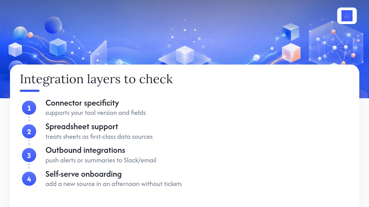
Most small businesses already run on a patchwork of tools, and a fast dashboard platform has to sit on top of that mess rather than replace it. Beyond the basic connector list, look at three integration layers that determine whether the dashboard actually becomes your team's single source of truth.
First, check whether the platform supports the specific version of your accounting, CRM, or e-commerce tool, not just the category. A connector labeled "e-commerce" that only pulls order totals and skips refunds or discounts will quietly distort your revenue numbers.
Second, look at how the platform handles spreadsheets you're not ready to migrate off of. Plenty of teams still keep a manually updated budget sheet or a vendor list in a spreadsheet, and a good platform treats that sheet as a legitimate data source alongside your CRM rather than forcing you to move everything into one system first.
Third, check for outbound integrations, not just inbound ones. A dashboard that can push an alert to Slack or email a weekly summary closes the loop, so stakeholders see the number without logging into a separate tool. Open-source examples of this pattern already exist, including a pipeline that auto-refreshes dashboards and pushes executive summaries to Slack without manual intervention, which shows the end-to-end pattern is technically proven, not theoretical.
The integration test that matters most: can you add a new source in an afternoon without a support ticket? If the answer is no, you've picked a platform that will slowly turn back into the manual reporting job you were trying to escape.
Author Perspective: What Actually Goes Wrong
The most common mistake I see is treating the metric definition step as optional. Teams rush straight to connecting sources and building a chart, then spend weeks arguing about why revenue doesn't match between two dashboards nobody agreed to define the same way.
The second mistake is chasing too many KPIs at once. One governed dashboard, tracked against a real business question, beats twelve half-built ones. Measure the hours it actually saves before adding a second dashboard, and let that number, not enthusiasm, decide your next move.
— Ąžuolas
Get a Live Dashboard Running With Vetros
Vetros builds the exact workflow this article just walked through, minus the manual setup. Describe what you want to see and Vetros connects to your data sources, handles ingestion and modeling on its own, and renders the chart, all while keeping the generated code readable and editable so you can verify exactly how a number was calculated. Data stays encrypted on Google Cloud, and lineage stays traceable back to the source, which covers the governance checklist above without extra configuration on your end.
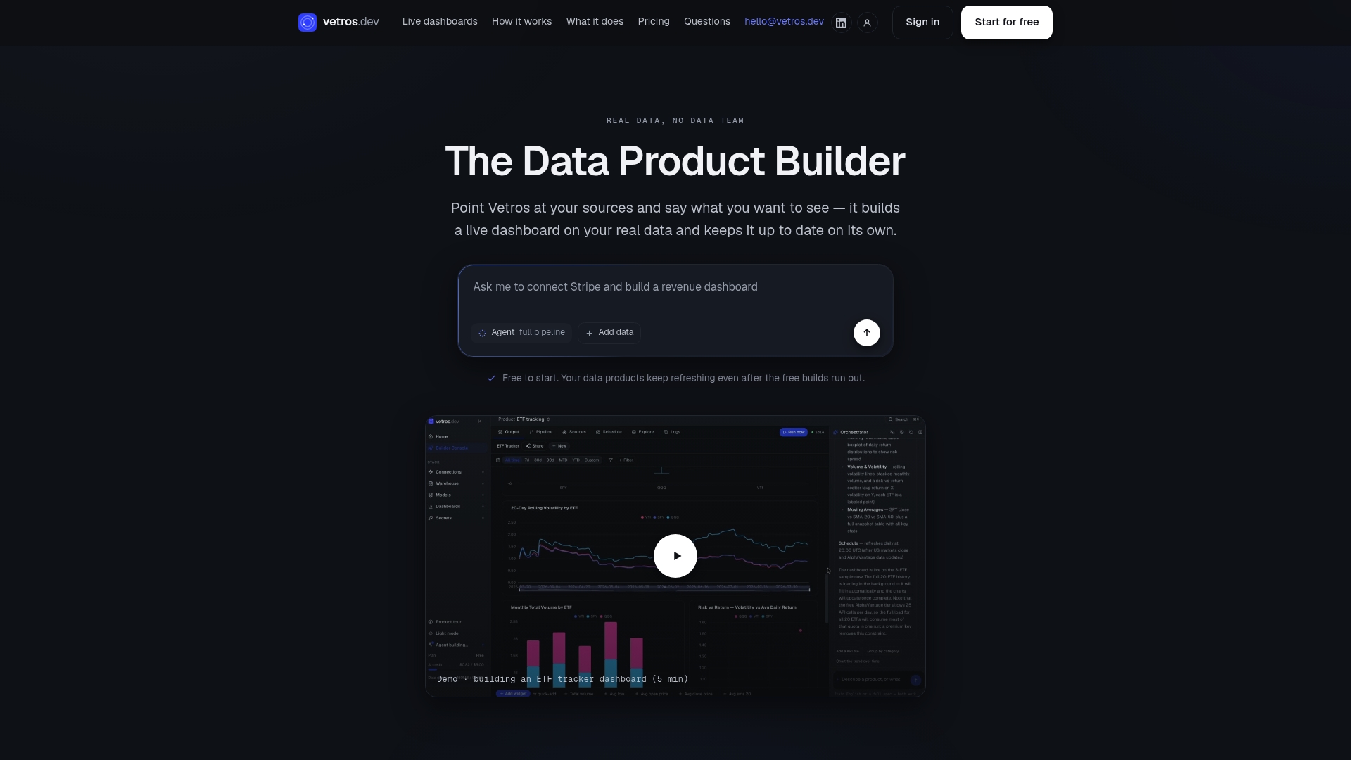
If you're past the spreadsheet stage and reconciling more than one source by hand every week, that's your sign to stop losing hours to manual exports. Start a trial at Vetros and connect your first source today. You'll have a working dashboard the same day, not after a months-long BI rollout.
Sources
- BIS implementation challenges — Esp (DOI entry)
- Nexus-Data-Agent (GitHub)
- Costs of manual reconciliation — Simplus
FAQ
What Makes a Dashboard "Fast" Beyond Just Loading Quickly?
In this context, "fast" refers to how quickly it's built and how automatically it stays current, not screen load speed. It means going from a plain-language request to a live, self-maintaining chart without a data engineering project.
Can a Non-Technical Team Really Build One Without an Engineer?
Yes, that's the specific gap autonomous platforms like Vetros close: you describe the report you want, and the platform handles connectors, modeling, and visualization on its own.
How Long Does It Take to See a Working Dashboard?
Connecting one or two sources typically takes minutes to an hour, and a working dashboard often appears the same day, compared to 3 to 9 months for a traditional BI rollout.
What Does Vetros Cost?
Vetros runs on tiered subscription pricing based on source count, refresh frequency, and seats, with a free trial to test builds. Current pricing details are listed on the Vetros site.
When Should I Stick With Spreadsheets Instead?
Stay on spreadsheets if you report monthly from a single source and one person owns the file. Once you're reconciling multiple sources weekly or losing several hours to manual exports, an autonomous dashboard usually pays for itself.