

A dashboard succeeds or fails in the first 5 to 10 seconds: if a user can't spot the status of the metric they care about and know what to do next in that window, the design has failed regardless of how much data sits underneath it. Getting there depends on a short list of proven moves: define purpose and audience, pass the 5-second rule, put primary KPIs up top, keep the hierarchy simple, meet WCAG accessibility standards, build in real interactivity, and test before you ship. The sections below turn each of those into something you can act on today.
TL;DR:
- Dashboards must enable users to grasp the primary metric and determine their next step within 5 to 10 seconds, tested through real user feedback.
- Layout choices vary based on dashboard purpose, with emphasis on grouping related elements and controlling visual saliency to guide the viewer’s eye effectively.
- Accessibility standards require contrast ratios of at least 3:1 for graphics and 4.5:1 for text, with full keyboard navigation and screen reader support built-in from the start.
- Interactivity should follow a natural, step-by-step flow from overview to detail, with easy undo functions and predictable filters to prevent cognitive overload.
- Performance relies on optimized data queries, caching, and lightweight charting to ensure load times stay within the critical 5-second window for user comprehension.
Table of Contents
- What Are the Core Dashboard Design Principles?
- How Should You Lay Out a Dashboard for the Right Reading Order?
- What Accessibility Standards Should Dashboards Meet?
- How Much Interactivity Should a Dashboard Have?
- How Do You Test and Refine a Dashboard Design?
- A Checklist and Template You Can Use Today
- What Are the Best Practices for Charts and Data Visualization?
- How Do You Handle Data Density Without Creating Clutter?
- How Should Dashboards Adapt Across Devices?
- What Performance Optimization Techniques Matter Most for Dashboards?
- Common Dashboard Mistakes and a Habit to Prevent Them
- When an Automated Dashboard Platform Makes Sense
- Sources
- FAQ
What Are the Core Dashboard Design Principles?
Every effective dashboard starts with a question, not a chart. Before you open Figma or wire up a data source, write down the exact decision the dashboard needs to support, and who's making it. A VP checking revenue health needs something different from an analyst hunting for churn drivers, and designing for both audiences on one screen is how dashboards end up serving neither.
From there, the 5-second rule becomes your design constraint: a user should identify the status of the primary metric and their next action within 5 to 10 seconds of looking at the screen. Test this literally. Show the dashboard to someone unfamiliar with it, give them 5 seconds, then ask what they saw. If they can't answer, the layout is doing too much.

Overview-first design follows naturally from that rule. Primary KPIs belong in the top zone (roughly the top third), with supporting detail unfolding as the eye moves down. Resist the urge to prove effort by cramming in every available metric. Simplicity means cutting any chart that doesn't change a decision, and annotating the ones that stay so a viewer doesn't have to reverse-engineer what a spike means.
A few habits keep the whole system coherent:
- Use one color to mean one thing across every chart. If red means "over budget" in one panel, it can't mean "trending up" in another.
- Standardize scales, units, and label formatting so a user isn't recalculating mentally between panels.
- Design at the actual display size the dashboard will run on, not a stretched browser window on your design monitor.
- Cap the number of distinct views per dashboard. More screens usually means the purpose wasn't defined tightly enough.
Performance is a design principle, not just an engineering afterthought. A dashboard that takes 8 seconds to render has already blown past the 5-second window before the user has even started reading it.
How Should You Lay Out a Dashboard for the Right Reading Order?
Layout choice depends on what the dashboard needs to do. An inverted pyramid pattern, big number at the top and drill-down detail beneath, suits status dashboards where one metric dominates the decision. A grid pattern fits comparison dashboards where several metrics carry roughly equal weight. A large annotated panel works when a single visualization, like a funnel or a map, is the whole story and everything else is supporting context.
Empirical research on how people actually scan dashboards complicates the old assumption that everyone reads top-left first. A study on dashboard reading order found that titles and KPIs are common entry points, but visual saliency, color, size, contrast, can override the expected top-left path entirely. If your most important number sits in a muted gray box while a decorative chart glows in saturated blue nearby, users will look at the blue chart first no matter where you placed it.
Practical takeaways for layout:
- Group related widgets spatially so the eye doesn't have to jump around to connect a KPI with its supporting trend line.
- Use saliency deliberately, size and color the metric that matters most, not the one that's easiest to make colorful.
- Put filters and time selectors in a consistent zone, usually top or side, so users always know where to change context.
- Design a clear question-to-answer progression: headline number, then the "why," then the detail.
Pro Tip: Squint at your dashboard, or blur it in a photo editor. Whatever still reads clearly is what your eye is actually drawn to first, and it should match your intended entry point.
What Accessibility Standards Should Dashboards Meet?
Accessibility isn't a final polish pass. It's a rendering decision you make before you write a line of chart code. The Web Content Accessibility Guidelines (WCAG) 2.2 set two numbers every dashboard designer should memorize: meaningful graphical objects need at least a 3:1 contrast ratio, and text needs 4.5:1. There's a thickness exception for very thin lines, but treat that as a last resort, not a design crutch.
Rendering choice matters more than most teams realize. SVG and DOM-based charts are cheaper to make accessible because screen readers can traverse the actual markup. Canvas and WebGL charts need a DOM proxy accessibility layer built alongside the visual layer, or accessibility gets bolted on late and never quite works right.
A working baseline includes:
- Full keyboard navigation with visible focus states on every interactive element.
- Live-region announcements when filtered data updates, so screen reader users know something changed.
- A data-table fallback for every chart, since tables remain the most reliable way to expose values programmatically.
Run a QA pass that checks contrast ratios with a real tool, tabs through the entire dashboard with no mouse, and confirms a screen reader announces both the KPI value and its change since the last period. This is the difference between "we added alt text" and something that actually meets WCAG's 3:1 non-text contrast requirement.
How Much Interactivity Should a Dashboard Have?
Treat a dashboard as an ongoing conversation rather than a static report. Research on cooperative dashboard design frames good interaction as turn-taking: the user asks a question through a filter or click, the dashboard answers, and the user refines from there. Interaction design should serve that back-and-forth, not just add toggles because toggles look sophisticated.
The interaction sequence that supports this best moves from overview to drill-down to filter to compare to a changed view, in that order. Users start broad, narrow in on what matters, then pivot to see it from another angle.
A few heuristics keep this workable:
- Let users undo or reset filters easily. Repair matters as much as the initial query.
- Keep dashboard state predictable. A filter shouldn't silently change what a KPI means.
- Make interactive elements discoverable through visible affordances, not hidden hover states users have to stumble onto.
- Weigh interaction richness against cognitive load. A dashboard for a first-time viewer needs fewer controls than one built for a daily power user.
Sometimes static clarity beats interactivity outright, especially for executive summaries where the answer needs to be obvious without a single click.
How Do You Test and Refine a Dashboard Design?
A repeatable process beats a brilliant first draft every time. Start by defining goals and users, then pick a dashboard genre (status, comparison, exploration) that fits the question you wrote down earlier. From there:
- Sketch low-fidelity templates before touching real data, so layout decisions aren't anchored to whatever chart type looked easiest to build.
- Build a working prototype with real or representative data.
- Run the 5-second test and a task-based test, where users have to actually find an answer, not just glance and describe.
- Log every tradeoff you made, why you cut a chart, why you accepted lower data density, and what acceptance criteria (clarity, performance, accessibility) it needs to meet.
- Iterate based on task success rate, time-to-insight, and error rate, then retest.
Pro Tip: Time-to-insight is the metric most teams skip and regret skipping. If it takes a test user 40 seconds to find something you designed for 5, the layout is the problem, not the user.
A Checklist and Template You Can Use Today
Before shipping, run through this list:
- Purpose is written down in one sentence, and every chart maps back to it.
- A first-time viewer can state the single most important takeaway within 5 to 10 seconds.
- Primary KPIs sit in the top zone, not buried below the fold.
- Contrast ratios pass WCAG's 3:1 and 4.5:1 thresholds.
- Every interaction has been tested with a keyboard alone.
- Load time is measured at final display size, not on a developer machine with a fast connection.
- Refresh cadence is documented and visible to the user.
A simple zone template works for most dashboard genres: title and context at the very top, primary KPI zone occupying roughly the top third, supporting visuals in the middle band, controls (filters, date range) anchored in a consistent spot, and a detail or exploration area at the bottom for users who want to dig further.
| Anti-pattern | Quick fix |
|---|---|
| Every metric gets equal visual weight | Size and color only the 1 to 3 KPIs tied to the core question |
| Filters scattered across the page | Anchor all controls in one consistent zone |
| Charts with no units or unclear scales | Label every axis and match scales across related charts |
| Dashboard tested only on a laptop | Test the exact display size and device the audience will actually use |
What Are the Best Practices for Charts and Data Visualization?
Chart choice should follow the data relationship, not personal preference or whatever looks visually interesting. Time-series data belongs in line charts. Part-to-whole comparisons work in bar charts more often than pie charts, since humans are notoriously bad at judging angle and area differences. Distributions call for histograms or box plots, not scatter plots dressed up to look busier than they need to be.
Annotation turns a chart from decoration into an answer. A spike in a line chart means nothing to a viewer unless a label explains what caused it, a product launch, a policy change, a data anomaly worth flagging. Don't make users hover over every point to find that out.
Consistency across charts matters as much as the choice within any single one. If a bar chart on one panel uses a Y-axis starting at zero and another panel truncates the axis to exaggerate a trend, you're not just creating visual inconsistency, you're misleading the reader. Keep axis conventions, color meaning, and rounding consistent everywhere.
Avoid dual-axis charts unless there's no other option. They're one of the most common sources of misread data because viewers instinctively compare the two lines' positions without registering that the scales differ. If you must use one, label both axes aggressively and consider adding a note calling out the scale mismatch directly on the chart.
Small multiples, repeating the same chart type across categories, often communicate more clearly than one crowded combination chart trying to show everything at once. They ask less of the viewer's short-term memory because the pattern to compare stays the same across every panel.
How Do You Handle Data Density Without Creating Clutter?
Data density and clutter are not the same thing, and confusing them is a common design mistake. A dense dashboard can still be clean if the information is organized well; a sparse one can feel cluttered if the few elements present are poorly aligned or inconsistently styled.
The real test for density is whether every element earns its place against the purpose you defined at the start. A chart that doesn't change a viewer's decision is clutter, no matter how small it is. Cut it, or move it to a secondary exploration area rather than the primary view.
Whitespace is a design tool, not wasted space. Margins between panels, breathing room around numbers, and consistent padding all reduce the cognitive effort needed to parse a screen. Dashboards that pack panels edge-to-edge force the eye to work harder just to figure out where one visualization ends and another begins.
Progressive disclosure solves the density problem better than cramming everything onto one screen. Show the summary number by default, and let users click through to the breakdown only when they need it. This matches the audience-density tradeoff seen across expert and novice users: expert users tolerate and often want dense, high-interaction layouts, while novices need message-first, lower-density views that get to the point faster. Segmenting by audience, rather than trying to build one dashboard that satisfies both, resolves most density complaints before they start.
Grouping related metrics under shared headers also reduces perceived density, even when the total number of data points stays the same. The brain processes five organized clusters of three metrics far more easily than fifteen scattered individually.
How Should Dashboards Adapt Across Devices?
A dashboard designed only for a widescreen monitor will fail the moment someone opens it on a tablet during a meeting or a phone on the way to one. Responsiveness isn't optional polish, it's a core part of whether the 5-second rule holds up outside the design studio.
Reflow, not shrink, is the right mental model. Simply scaling down a desktop layout makes text unreadable and touch targets too small to tap accurately. Instead, the layout should reorganize: KPI cards that sat in a row on desktop stack vertically on mobile, secondary charts collapse into expandable sections, and detail tables convert into scrollable cards rather than tiny, unreadable grids.

Priority order matters more on small screens because there's no room to show everything at once. Decide in advance which 1 to 2 metrics absolutely must appear above the fold on a phone screen, and design the mobile layout around that decision rather than treating it as a scaled-down afterthought.
Touch targets need to be larger than mouse-driven controls, generally at least 44 pixels in either dimension, and filters that work fine as dropdown menus on desktop often need to become full-screen selection panels on mobile to stay usable.
Test on the actual devices your audience uses, not just a browser resized to look like a phone. Real devices reveal problems like slow rendering on older hardware, touch targets that overlap, and charts that render fine on a laptop screen but become unreadable at phone resolution. If your audience genuinely splits between desk-bound analysts and field staff checking numbers on a phone, design and test for both from the start rather than retrofitting mobile support later.
What Performance Optimization Techniques Matter Most for Dashboards?
Speed is part of the design, not a technical detail handled downstream. A dashboard that takes several seconds to render has already lost the 5-second window before a user has processed anything on screen.
Query efficiency is usually the biggest lever. Pre-aggregating data at the source, rather than pulling raw rows and aggregating in the browser, cuts load times dramatically on large datasets. Materialized views or summary tables that update on a schedule mean the dashboard is reading something already computed, not recalculating on every page load.
Lazy loading keeps initial render fast by loading only what's visible above the fold first, then fetching detail panels and secondary charts as the user scrolls or clicks into them. This matters even more on mobile, where both bandwidth and processing power are more limited.
Caching strategy needs to match how often the underlying data actually changes. A dashboard tracking daily sales doesn't need to hit the database on every page refresh if the data only updates once an hour. Cache aggressively for anything that doesn't need to be second-by-second live, and reserve real-time queries for the metrics where staleness genuinely costs the business something.
Chart library choice affects performance more than most teams expect. Rendering thousands of data points with a heavy charting library can freeze a browser tab, where a lighter-weight library or a pre-aggregated view of the same data renders instantly. If a chart needs to show granular detail, expose it through drill-down rather than rendering every point by default.
Set a performance budget the same way you'd set a design budget: a maximum load time target, and a cap on the number of simultaneous queries a single dashboard view can trigger.
Common Dashboard Mistakes and a Habit to Prevent Them
The most common mistake is overload: teams keep adding charts because stakeholders keep asking for "just one more view," and the dashboard slowly stops answering any question clearly. The fix is a habit, not a redesign. Run the 5-second test on your dashboard once a week with someone who didn't build it.
Cross-functional review catches blind spots a single designer or analyst won't see alone, and early testing with actual users, not just the requesting stakeholder, surfaces confusion before it ships. Treat every dashboard as a hypothesis about what people need to see, and keep checking whether it's still right.
— Ąžuolas
When an Automated Dashboard Platform Makes Sense
Every principle above still has to be built, connected to real data, and kept current, and that's where most teams without a dedicated data engineer get stuck. Some automated dashboard platforms handle that gap by connecting to your data sources, managing ingestion and modeling, and building live dashboards from a plain-language description of what you want to see, without requiring a data team to maintain the pipeline behind it.
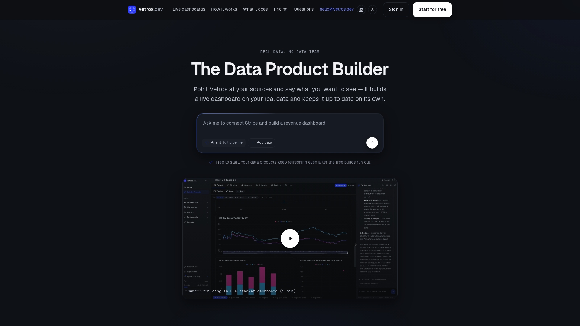
Such platforms fit teams that have the design judgment covered by the principles above but lack the technical resources to keep dashboards accurate and current. Code may stay visible and editable, and data storage private, so nothing about the automation is a black box. If you want to see how a dashboard built around a single clear question comes together automatically, check the available plans and start with a free build.
Sources
- Web Content Accessibility Guidelines (WCAG) 2.2
- Heuristics for supporting cooperative dashboard design (MIT CSAIL)
- Not Always Top-Left: Untangling the Signals that Guide Dashboard Reading Order
FAQ
What Are the Core Design Principles for a Dashboard?
The core principles are defining purpose and audience, passing the 5-second rule, placing primary KPIs in the top zone, keeping the visual hierarchy simple, meeting WCAG contrast and keyboard standards, building real interactivity, and testing before you ship. Each one addresses a specific failure mode, from confused audiences to inaccessible charts, that shows up repeatedly in poorly performing dashboards.
What Is the 5-Second Rule for Dashboards?
The 5-second rule states that a user should be able to identify the status of the primary metric and their next action within 5 to 10 seconds of viewing the dashboard. You test it literally by showing the dashboard to someone unfamiliar with it for a few seconds and asking what they saw.
What Are the Three Key Aspects of Designing a Great Dashboard?
Most designers converge on three pillars: a clearly defined purpose and audience, a layout that puts the most important information first, and an accessible, tested execution. Skipping any one of the three tends to produce a dashboard that looks fine in a design review but fails in daily use.
What Are the Three Layers of a Dashboard?
A practical way to think about dashboard structure is three layers: an overview layer showing primary KPIs, a supporting layer with trends and comparisons, and a detail layer for drill-down and exploration. This mirrors the top-zone KPI placement recommended for overview-first design.
Can a Platform Like Vetros Help Apply These Principles Automatically?
Vetros connects to your data sources and builds live dashboards from a plain-language description, applying structural principles like KPI placement automatically while keeping the underlying code visible and editable. Current plans and pricing are listed on the Vetros site, including a free tier for initial builds.