

Yes, Airtable's Interface Designer supports interactive analytics dashboards that can track KPIs and let stakeholders drill into records. Getting one that actually works takes three moves: decide who the dashboard serves and which KPIs matter, connect or sync your data cleanly, then compose dashboard elements around those numbers. Watch sync and API limits early, since those, not the design tools, are what usually cause a dashboard to slow down or fall behind.
TL;DR:
- Airtable dashboards work best when KPIs are limited to three to seven critical metrics directly tied to decision-making processes.
- Heavy automations, large data syncs, or complex formula chains can slow down dashboard performance, requiring batching and filtering.
- Building and editing dashboards need owner or creator permissions, with careful planning around visibility, filters, and mobile accessibility to ensure usefulness.
- Near real-time data updates depend on sync cadence and automations and are not continuous, so stakeholders should be informed about potential delays.
- For teams lacking long-term maintenance capacity, managed solutions like Vetros can provide live, current dashboards without ongoing upkeep.
Table of Contents
- What an Airtable dashboard can actually do for your team
- Getting started: plan KPIs, data model, and permissions
- Build the dashboard in Interface Designer: groups and elements
- Customize visuals, filters, and interactivity for real users
- Real-time updates and performance: what to expect and how to fix lag
- Publish, share, and manage permissions for interface pages
- Templates and quick KPI examples worth copying
- When to offload dashboard automation and maintenance
- A practical note on where to start
- Vetros: a live dashboard without the maintenance work
- Authoritative documentation and how-to resources
- Sources
- FAQ
What an Airtable dashboard can actually do for your team
An Airtable dashboard, built inside Interface Designer, can show number aggregates, charts, pivot tables, lists, timelines, and summary cards, all pulled from your base data and clickable through to the underlying records. That range covers most of what a small or mid-sized team needs without touching a separate BI tool.
The right layout depends on who is looking at it and how often. A weekly executive review wants a handful of scorecards and a trend chart, refreshed on a schedule the viewer understands. A team lead watching support tickets or campaign spend day to day wants something closer to live monitoring, with filters they can adjust themselves. Mixing the two on one page usually confuses both audiences.
Common use cases include:
- Executive reporting: a small set of scorecards and trend lines reviewed weekly or monthly.
- Operational monitoring: ticket queues, inventory counts, or campaign spend tracked near continuously.
- Project roadmaps: timelines and status summaries for cross-functional teams.
- Campaign or sales tracking: pipeline value, conversion counts, and pacing against targets.
Before building anything, decide which of these you're making. A monitoring dashboard needs faster, filtered data feeds and simpler visuals; a reporting dashboard can tolerate a daily sync and can carry more detail per screen.
Getting started: plan KPIs, data model, and permissions
A dashboard is only as good as the base behind it, so the planning stage matters more than the interface itself.
- Pick 3 to 7 KPIs that map to real decisions, not just numbers that are easy to pull.
- Trace each KPI back to a specific field, rollup, or formula in your base, and confirm the source table already tracks that data cleanly.
- Build or clean up the views and summary fields (grouped views, rollups, linked records) that will feed each chart or scorecard before you touch Interface Designer.
- Confirm who has Owner or Creator permissions, since building or editing an interface dashboard requires that access level, and check that your plan tier includes Interface Designer.
- Run a short readiness check: does every KPI have a clean field, does every view filter correctly, and does at least one person have build permissions?
Schema quality drives dashboard accuracy more than any setting inside the dashboard editor. If a rollup is pulling from the wrong linked field, or a status field allows inconsistent text entries instead of a single-select, the dashboard will faithfully display bad numbers. Cleaning that up before you build saves a lot of rework later.
Pro Tip: Build one throwaway test view per KPI first and eyeball the numbers against records you know by hand, before wiring anything into a chart.
Build the dashboard in Interface Designer: groups and elements
Once your base is clean, building the dashboard itself is mostly a matter of choosing the right element for each KPI.
Start by adding a new dashboard page in Interface Designer, then create dashboard groups. Each group sources data from a single table, so plan your groups around the tables your KPIs live in rather than trying to force everything onto one group.
Element choices to know:
- Number elements work best for a single scorecard figure, like total revenue or open ticket count.
- Charts handle trends and comparisons, including multi-series and dual-axis setups when you're comparing two different scales, such as units sold against revenue.
- Pivot tables suit cross-tabulated summaries, like sales by region and by product line in one view.
- Lists show the underlying records behind a metric, useful for drilling into specifics.
- Timelines fit project or campaign schedules where dates matter more than totals.
- Summary cards group a few related scorecards together for a compact overview section.
When configuring a chart, pick the aggregation function deliberately. Sum works for revenue or unit counts, but average or count-distinct often tells a truer story for things like ticket volume or customer counts, where a sum would overstate the picture.
Layout matters as much as the elements themselves. Put the two or three numbers stakeholders check first at the top of the page, group related charts together, and resist the urge to cram every available field onto one screen. A dashboard that takes ten seconds to scan is more useful than one with twice the data and no visual hierarchy.
Pro Tip: Build one group per stakeholder question, not per table. If sales and support both live in the same base, keep their dashboard groups visually and structurally separate even if they share underlying data.
Customize visuals, filters, and interactivity for real users
A dashboard people actually use needs a few interactivity choices made deliberately, not left to defaults.
- Set up user filters and tabs so stakeholders can slice the view themselves without editing anyone else's saved filters.
- Use conditional coloring and thresholds on scorecards or charts to flag numbers that need attention, like a support queue over a set size or spend past a budget line.
- Decide case by case whether viewers should be able to click through to underlying records. That's useful for operational dashboards but risky on anything showing sensitive customer or financial detail.
- Check every dashboard on a smaller screen before sharing it. Multi-series charts and wide pivot tables often need a simplified mobile layout, since Interface Designer renders differently across screen sizes.
None of these choices are permanent. Revisit filters and color thresholds once real usage patterns show up, since the anomaly worth flagging in month one is often different from the one that matters six months later.
Real-time updates and performance: what to expect and how to fix lag
"Near real-time" is the honest description of what Airtable dashboards deliver: data refreshes on the cadence your syncs and automations run, not as a continuous stream. Setting that expectation with stakeholders up front avoids a lot of frustration later.
Several things commonly slow a base down enough to make dashboards feel sluggish or stale:
- Large sync bursts that push many record updates through at once.
- High automation volume running against the same tables the dashboard reads from.
- Heavy computed-field chains, where one formula recalculating triggers a cascade of others.
- API call volume bumping against rate limits, which throttles how quickly new data can land.
Airtable's own troubleshooting guidance names integration architecture, automation volume, and active syncs as the most common causes of a base feeling unresponsive. That points troubleshooting toward the data pipeline first, not the dashboard interface itself.
Mitigations that work well in practice: reduce the number of computed fields chained together, use filtered or partial syncs so you're only pulling what the dashboard needs, batch large updates instead of pushing them all at once, and schedule heavy automations for off-peak hours rather than running them continuously. When you're not sure what's causing lag, check the Airtable status page first, then isolate which sync or automation is generating the most record writes, and audit your computed-field dependency chains for anything doing more recalculation than it needs to.

Publish, share, and manage permissions for interface pages
Publishing an interface makes it viewable to whoever you grant access to, without exposing edit rights to the underlying base by default. That separation is what makes dashboards safe to share more broadly than the raw data itself.
- Building or editing a dashboard requires Owner or Creator permissions on the base; viewers can be granted read-only access to just the published interface.
- Share links can be scoped to internal collaborators or, on eligible plans, made accessible to people outside your workspace.
- For external stakeholders, share the published interface link rather than base access, and review who has that link periodically.
- Keep a record of major layout or KPI changes, since interfaces don't carry the same revision history as base records, and an informal changelog helps with auditability later.
Governance is worth treating as an ongoing task, not a one-time setup step, especially once more than one person can publish changes.
Templates and quick KPI examples worth copying
A few starting KPI sets cover most common dashboard needs:
- Executive: revenue, gross margin, active customers, and pipeline value.
- Sales: pipeline value, win rate, average deal size, and quota attainment.
- Support: open ticket count, average resolution time, backlog age, and customer satisfaction score.
- Marketing: campaign spend, leads generated, cost per lead, and conversion rate.
A compact sales KPI dashboard is a good first build: create a view filtered to open and won deals, add rollup fields for pipeline value and win rate, then add a Number element for pipeline value, a Chart for win rate trend over time, and a Pivot table breaking deals down by rep and stage.
As record volume grows, revisit the views feeding each element. A filter that worked cleanly at a few hundred records can slow down or misbehave at several thousand, so periodically check that grouped views and rollups still reflect what the dashboard shows.
When to offload dashboard automation and maintenance
Building and maintaining an Airtable dashboard yourself works well when your team has the time to manage schema, syncs, and automations as data volume grows. Not every team has that bandwidth, and that's where an autonomous option changes the calculation.
- Vetros autonomously builds and maintains real-time dashboards without requiring a dedicated data team to manage the process.
- It connects to data sources automatically and handles ingestion, modeling, and visualization, so teams describe what they want to see rather than configuring pipelines by hand.
- Users can read and modify the underlying code directly, which keeps the process transparent and traceable rather than opaque.
- The result is a live dashboard that stays current, which supports faster and more accurate decisions without ongoing manual upkeep.
For teams weighing cost and governance tradeoffs of managed services, resources like Cost Beacon offer a useful lens on cloud cost and security review before committing.
A practical note on where to start
Start small: pick one KPI set, one base, and measure whether the dashboard actually changes a decision before adding more complexity. Most dashboard projects fail from scope creep, not from a missing feature. Iterate on schema before layout, and if your team lacks the bandwidth to maintain syncs and automations long term, an evaluation of a managed alternative is worth the hour it takes.
— Ąžuolas
Vetros: a live dashboard without the maintenance work
Vetros connects to your data sources automatically, then handles ingestion, modeling, and visualization so you describe what you want to see instead of building pipelines. That fits teams without a dedicated data person who still need dashboards that stay current.
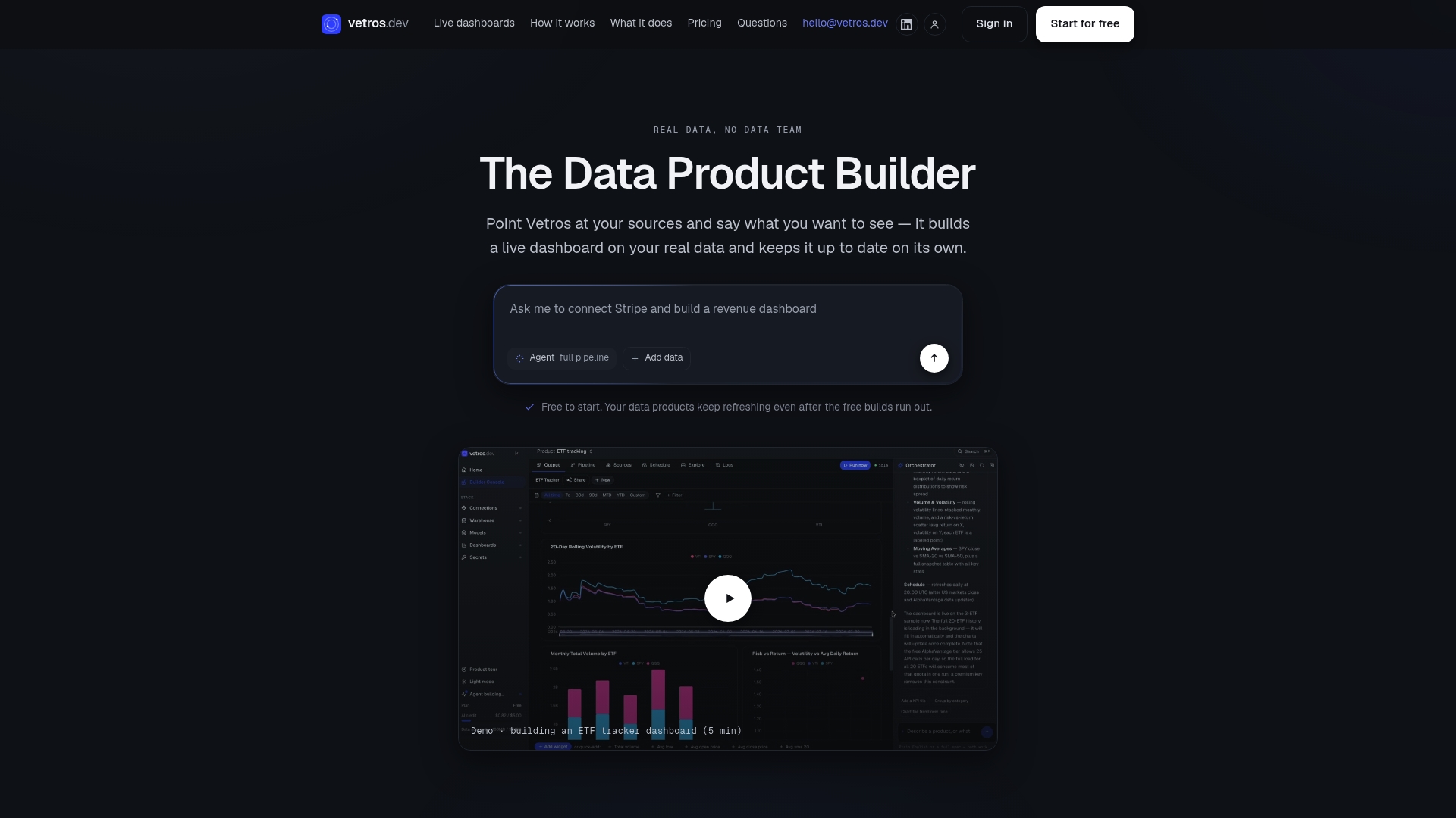
Small business owners, analysts, and freelancers running KPI tracking without engineering support tend to benefit most. Start with the Free plan or explore Pro and Team pricing to see if an autonomous dashboard fits your workflow.
Authoritative documentation and how-to resources
- Airtable interface layout: dashboard
- Airtable Sync integration: Sync API
- Troubleshooting Airtable base performance
- Creating real-time dashboards in Airtable
Sources
Airtable dashboards are only as current as the data feeding them, and how you bring data in shapes both freshness and reliability.
- Airtable interface layout: Dashboard
- Troubleshooting Airtable base performance
- Creating Real-Time Dashboards in Airtable for Better Decision-Making
"Real-time" in Airtable almost always means near real-time: data lands on whatever cadence the sync or automation is set to run, not a continuous stream. That distinction matters when you're promising stakeholders a live view.
Sync integrations into Airtable run strictly one way, and setup requires configuring PAT scopes and update frequency explicitly, which means there's no built-in path for writing changes back out to the source system.
Watch for practical caps: CSV and API-based syncs commonly hit request-size and record-count limits, and the Airtable Web API enforces a 5 requests per second limit per base with quotas that vary by plan. When a dataset is too large or updates too frequently for a single sync, split it into batches, filter down to only the fields and records the dashboard actually needs, or stage the heavier processing outside Airtable entirely before syncing in a clean, smaller feed.
FAQ
Can you make a dashboard in Airtable?
Yes, Airtable's Interface Designer supports building dashboards with number elements, charts, pivot tables, lists, timelines, and summary cards pulled from your base. Building or editing one requires Owner or Creator permissions on the base.
What are the downsides of using Airtable?
Airtable dashboards can slow down when automations, active syncs, or heavy computed-field chains push a lot of recalculation through a base at once. Sync integrations also run one way only, and API and sync operations carry rate and size limits that require batching for larger datasets.
How do I create an analytics dashboard?
Start by defining a small set of KPIs tied to real decisions, then build clean views and rollups in your base before touching the interface editor. From there, add a dashboard page, create groups sourced from the relevant tables, and choose elements like number cards, charts, or pivot tables that fit each KPI.
Is Airtable basically Excel?
No, Airtable is a database with spreadsheet-like views, built to link related tables and power dashboards, automations, and syncs that a flat spreadsheet can't handle natively. Excel remains stronger for complex offline calculations, while Airtable is built for structured, connected data feeding live interface dashboards.