

An AI dashboard turns a plain-language request into a live, governed visualization, cutting out most of the manual SQL and chart-building that traditional business intelligence requires. Vetros builds on this idea by automating the ingestion and modeling behind the scenes, so a team gets faster answers without hiring a data engineer. The core payoff is speed paired with trust: fresh numbers you can actually verify.
TL;DR:
- An AI dashboard enables real-time, natural-language requests for visualizations, significantly reducing manual chart-building and SQL coding.
- Its accuracy and trust depend on governance, clear metric definitions, lineage visibility, and real-source traceability, not just interface simplicity.
- Effective implementation requires defining canonical metrics, testing with real data, and establishing security, lineage, and monitoring before full deployment.
- The main challenge for daily use is maintaining metric consistency and governance amid multiple users and phrased variations, preventing trust erosion.
- Vetros offers a prompt-driven platform that automates data ingestion and modeling, allowing users to build traceable, trustable dashboards on their own data sources.
Table of Contents
- What Is an AI Dashboard, and How Does It Work?
- How Do Different Roles Use AI Dashboards?
- How Do You Evaluate and Choose an AI Dashboard?
- How Do You Implement an AI Dashboard Without a Data Team?
- The Gap Between AI Dashboard Demos and Daily Use
- Try Vetros for Your Next Dashboard
- Sources
What Is an AI Dashboard, and How Does It Work?
An AI dashboard is a reporting interface that builds and updates itself from a natural-language description instead of a manually configured chart library. The workflow flips the old order: instead of "model the data, then build the chart, then hope someone asks the right question," it's prompt, then model, then layout, then a conversational follow-up. You describe what you want to see. The system picks the visualization, calculates the metric, and keeps it live.
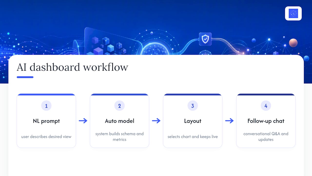
A few capabilities separate this from a static BI tool. Natural-language chart generation lets you type "show weekly signups by channel" and get a chart, not a blank query editor. Auto metric calculation handles the aggregation logic behind that chart. Anomaly detection flags a spike or drop before anyone has to notice it manually, and forecasting projects where a metric is headed. Some platforms also expose "dashboard-as-code," meaning the underlying queries are visible and editable rather than locked behind a drag-and-drop interface, an approach Databricks documents through lineage that traces each visual back to its source tables.
The freshness question matters more than it sounds. A cached snapshot is cheap to generate but stale within hours. Live queries cost more to run but reflect what's actually happening right now, which is the entire point of an operational dashboard.
How Do Different Roles Use AI Dashboards?
The value looks different depending on who's asking the question.
- Marketers lean on anomaly alerts to catch a campaign that suddenly underperforms, plus daily summaries that replace the Monday-morning ritual of pulling numbers into a slide.
- Analysts use conversational follow-ups to run root-cause analysis without writing a new query every time, which cuts down on repetitive manual SQL work.
- Product and operations teams watch live health metrics, like uptime or churn signals, with automated alerts instead of checking a spreadsheet twice a day.
None of this replaces a governed warehouse or a trained analyst. Complex modeling, cross-source joins, and judgment calls about what a metric should even mean still need a human who understands the business. AI dashboards handle the repetitive layer on top of that foundation, not the foundation itself.
How Do You Evaluate and Choose an AI Dashboard?
Every vendor demo looks impressive with a clean sample dataset. The real test is whether the platform holds up on your data, your permissions, and your refresh schedule. Rank these criteria roughly in this order:
- Governance and a metric layer. Does "revenue" mean the same thing on every dashboard, or does each chart quietly recalculate it differently?
- Explainability. Can you click a number and see exactly which table and query produced it, the way Databricks' lineage feature does?
- Integrations and connectors. Does it plug into the sources you already use, or does it require middleware you'll have to maintain?
- Refresh and scale. Can it handle live queries at your data volume without lag or runaway warehouse costs?
- Security and permissions. Does it support row-level access so a regional manager sees their region, not everyone's numbers?
- Automation and agents. Can it summarize trends or trigger alerts on its own, the kind of embedded monitoring Taskade builds into its live dashboards?
- Pricing transparency. Is the cost tied to something predictable, like sources or seats, or will it balloon with usage?
In a trial or demo, ask pointed questions: Which connectors are natively supported versus "coming soon"? Can you trace a number back to its source query? What's the uptime SLA for live refresh? What exactly can an embedded agent do versus what's marketing language?
Pro Tip: Ask for a dashboard built on one of your messiest real data sources during the demo, not the vendor's clean sample set. That's where you'll see whether the natural-language layer actually holds up.
Watch for red flags: vague answers about where metrics are calculated, no way to view the underlying query, and refresh rates that quietly degrade once you're past the trial tier.
How Do You Implement an AI Dashboard Without a Data Team?
- Inventory your data sources and define canonical metrics. List every source you'll connect and assign an owner to each key metric's definition. Skipping this step is the number one reason dashboards drift into disagreement.
- Prototype with live data. Build a small, prompt-based dashboard connected to real sources rather than a mockup. Figma's prompt-to-prototype approach shows why previewing with real data speeds stakeholder buy-in versus static wireframes.
- Validate against known numbers. Cross-check the AI-generated metrics against a query you already trust. If they don't match, find out why before rolling out further.
- Harden for production. Add lineage, row-level access controls, and monitoring so the dashboard survives contact with more users and more edge cases.
- Operate on a schedule. Set a refresh cadence, define who's alerted when something breaks, and audit the dashboard periodically as sources change.
Open-source query engines and connector projects from groups like the Apache Software Foundation often sit underneath this stack, handling the plumbing so the dashboard layer can focus on interpretation.
The Gap Between AI Dashboard Demos and Daily Use
Most AI dashboard pitches sell the prompt. Type a sentence, get a chart, done. That part genuinely works now, and it's not hype. What gets glossed over is what happens on day forty, when three people have typed three slightly different phrasings of "monthly revenue" and gotten three different numbers, because nothing enforced a single definition underneath the friendly interface.

That's the part worth being blunt about: a chat window is not governance. The platforms that hold up are the ones that treat the metric layer and the lineage as the product, and the natural-language interface as the surface people happen to touch. If a tool can't show you which table produced a number, it's not more trustworthy than a spreadsheet, it's just faster to build.
Where I'd push back on conventional wisdom is the assumption that "no-code" and "no oversight" go together. They shouldn't. The best implementations still assign metric owners and still validate against known queries, they just do it once, up front, instead of re-litigating it every time someone opens a new tab. Speed and trust aren't actually in tension here. Skipping the trust part just makes the speed temporary.
— Ąžuolas
Try Vetros for Your Next Dashboard
Vetros is built around that exact philosophy: describe what you want to see, and the platform handles ingestion, modeling, and the live dashboard behind it, without asking you to hire a data engineer first.
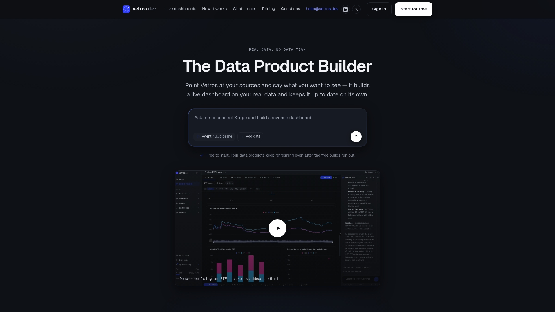
A trial run typically means connecting real data sources and watching the platform build working prototype dashboards against them, so you can test your actual connectors instead of a demo dataset. Charts stay traceable back to their sources, and the underlying code is readable if you want to check or adjust it yourself. If you're evaluating options against the criteria above, start a trial with Vetros and see how it handles your own data before committing to anything.
Sources
For hands-on prototyping, Figma's AI dashboard generator shows how prompt-driven mockups speed design review. Taskade's live dashboard builder covers embedded agents and automation. Databricks' AI-assisted dashboards documentation is worth reading on lineage and explainability. For the plumbing underneath most implementations, the Apache Software Foundation maintains the query engines and connectors many of these platforms rely on. To see the autonomous, no-code approach in practice, visit Vetros.